
I enjoy this shot a lot. The composition is perfect and fits well into the rule of thirds. The boat is coming in at the perfect spot to create an implied horizon line, as does the extension of the net. The placement of the fisherman and the pole in the water is great as well. Some variation of the color and pattern of the water would ad to shot but I also like it as is.

Skill and luck are often paired together to create a great image. The photographer wasn't directing this boy, she found and captured the exact moment that worked. The fact that the boy's gesture somewhat mimics the curved pattern where the ocean meets the rocky shore is powerful. The rule of thirds is used here several times. Once for the boy, once for the peak in the rocks and once for the positioning of the where the water meets the shore. What could have been a simple shot is made complex by the photographer's framing and also by their patience in waiting for the right moment.

The lone gull flying before the glacier works because of the rule of thirds. The gull is in the sweet spot. The horizon is low, but still within a good range, and the glacier itself is split up into different colors and ice forms. What also makes this shot stand out compositionally, it the white glacial ice in the center. It creates a graphic divide that's visually interesting and makes the image that much more complex.
6,354 Images entered

This architectural and colorful gem of a photo is greatly enhanced by the use of the rule of thirds. The window is in the sweet spot on the left hand side. The blue and orange wall are perfectly split into thirds, the result being a blue horizon line if you will. The yellow and red striping on the right side the frame ads so much to this shot. Without it, the image would feel flat. The additional colors make the shot pop out. They may not take up a full one third of the right side of the frame, but it's enough for me.
3,799 Photographers

I love the placement of the wreck on the beach is perfect. What's bothering me here is the horizon line. I wish it would have been a bit lower. A lower horizon line would have let the wreck stand out against the sky better than it does against the breaking waves. I do like the long shadow created by the early morning light. It points us to the other side of the frame, which would have been empty without it.


I love this vintage looking image of the chemist standing in his doorway. This is a busy shot, with a lot going on, and it's done so well, that the business becomes an attribute. The rule of thirds was definitely applied here. The chemist is in the sweet spot on the left side of the frame, while the only other person in the shot is that of a double reflection in the shop window. It's not accident that this other person is also placed perfectly in the sweet spot on the right third of the image. The image also has horizontal lines that split up the space into more than thirds, but I would argue that the strong horizontal lines of the brick meeting the window sill and the middle and upper window frames work well to give an implied 1/3 split.

While I really love this shot of the jellyfish positioned perfectly for the rule of thirds, it leaves me wanting more. Maybe a tighter crop? Maybe some change in the background. This is an instance where using the rule of thirds certainly helps the image, but used alone isn't enough to create a dynamic composition. I know the photographer was going for minimalism and that was achieved. I think perhaps pushing in on the jellyfish, while keeping it in the sweet spot would help make this image stand out more.

Love this fox in the snow. The fox is placed well in the lower right side and the slanted hill side takes up just a third of the frame, leaving the snow filled sky to take up the remaining two thirds. I wish that I could see the fox a bit better though. I realize that it's quite difficult to shoot in the snow and not have the snow get in the way of the subject's face.

This graphic shot of a farmer tilling the paddy works for me even though the farmers face is hidden. Normally I would want to see the person's face but this shot is all about the graphic form and color. The rule of thirds has been applied with several things. There's the horizontal banding of the rice paddy itself. The farmer is also placed in the one third sweet spot on the left side of the frame, creating a feeling of tranquility and order. There are also the footprints that guide our eye to the farmer. They lead us directly to the sweet spot on the bottom left side of the frame and are an important part of this composition. If the farmer had been put in the center the shot would lose its dynamism.

This photograph, while pixelated (probably due to cropping) is still one of my favorites. It's simple. It's elegant. It's dynamic. Without using the rule of thirds this image would lose it's feel and the ball players might feel like they're floating in a void, rather than being placed just right. There is a strong implied vertical line along the right third of the photo. The boy kicking the ball, the ball itself and the two boys at the bottom of the frame create this strong vertical line. There is also an implied horizontal line created by the boy in the top left of the composition. His feet are perfectly placed to bisect the frame along the top one third line.

This stunning butterfly shot is so simple and yet so elegant. The rule of thirds is used to create dynamism and tension in the composition. The butterfly is perfectly placed on the right third of the shot, while the pink flower is nicely placed not the left hand side. The use of color and shading from right to left also creates a bit of splitting the frame into thirds. We go from a gray pink on the left, to a brighter pink and then to blue. This wave of color creates a lot of interest and gives this shot it's ethereal feel.

Wow! This image captures all the curiosity of the viewer. Who is the boy? Why do we only see part of him? Is the rest in such dark shadow that we can't see him? When a photograph compels the viewer to ask questions it can be a very good thing. We want things left up to our imagination and unique interpretation. The boys' eye is placed exactly where it needs to be to use the rule of thirds. It's so clear and such a strong shot that the simple choice to frame the boy as such makes the rule of thirds wash away the other strong graphic elements going on here. Without the boy's eye, this shot would simply be an interesting graphic and wouldn't have caught my eye.


What a dynamic composition. The photographer has used multiple tools to create this. The low angle helps bring the viewers eye to the person standing at the mouth of the ice cave in a way that creates a forced perspective. The main subject is set perfectly along on the left side, exactly where the image would split in three. There also seems to be something else on the right side of the shot, also along the 1/3 mark. I can't tell if it's two other people there, or perhaps some equipment, but whatever it is it ads to the mystery of the shot. What is he looking at besides the horizon? The horizon line itself is also almost at the bottom third line and could have been set just a bit lower, but I see why the photographer chose to keep it a bit higher; the amber reflection of the sky on the ice floor is dazzling and something special to see. With the rule of thirds, one must keep it mind, but take liberties as needed to make the most dynamic composition.


Meet the expert judge
Brief
See more contest details
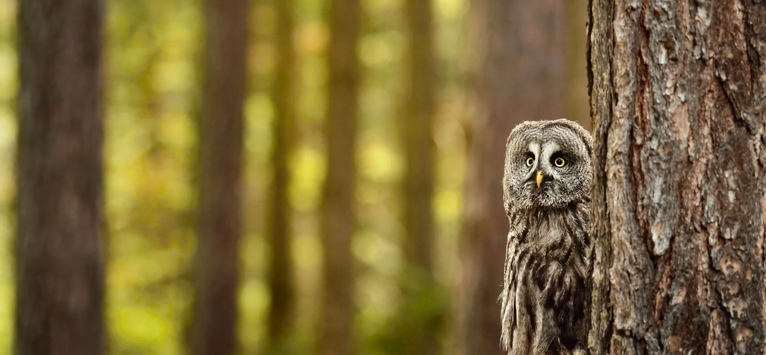
The rule of thirds is a compositional guideline or ‘rule of thumb’ that can be employed in order to strengthen the composition of one’s images. It advises that prominent vertical or horizontal features within the image, such as a horizon, a tree, or a main portrait subject, be placed one third of the way into the image, either vertically or horizontally. Hence a horizon would be placed either one third of the height of the image from the top, or the bottom, in order to give the most pleasing composition for the viewer. In reality of course one often relies more on gut feel, and not all scenes offer the possibility of using this rule. But it can be a handy guide to keep in one’s head when playing around with the composition of a scene. Do please use the Not on Brief button sparingly in this contest. Whether images conform strictly to this rule or not is often difficult to adjudicate on, so let’s give each other the benefit of the doubt, and enjoy the debate instead.