
One of the secrets to a successful still life is making sure that elements in the frame relate to one another: whether via colour, shape, function, or form. This is a wonderful example. Everything in this image, whether it’s centrally placed and sharply focused or positioned at the edge and purposefully soft has a reason for being there and adds to the mood.

The lighting, the space between each element, the black background – everything has been beautifully thought out and executed here. Most of the ingredients are tilted slightly to add a sense of three-dimensionality and the wood plinth gives a solid-looking base and extra height to the composition. Plus, it adds a stage for the vine of tomatoes to cascade down. Most of all, everything looks appetising. Perfect.

3,635 Images entered

The contrast in colours and textures here is striking and using sunflowers that have passed their best is a wonderful touch – so often we look for pristine blooms and forget that wilting flowers often have lovely structure. Including the oval of the table at the bottom keeps the composition nicely grounded. My one small complaint is that the highlight at the top right of the frame is a little too bright and takes my eye away from the vase. Otherwise, beautiful.


The gentle, painterly look here was created using small handheld lights moved over the set. It’s a fabulous technique that requires plenty of trial and error. The colour of each object has been chosen carefully and nothing is overpowering or jarring to the eye. The balance of positive and negative space couldn’t be better.


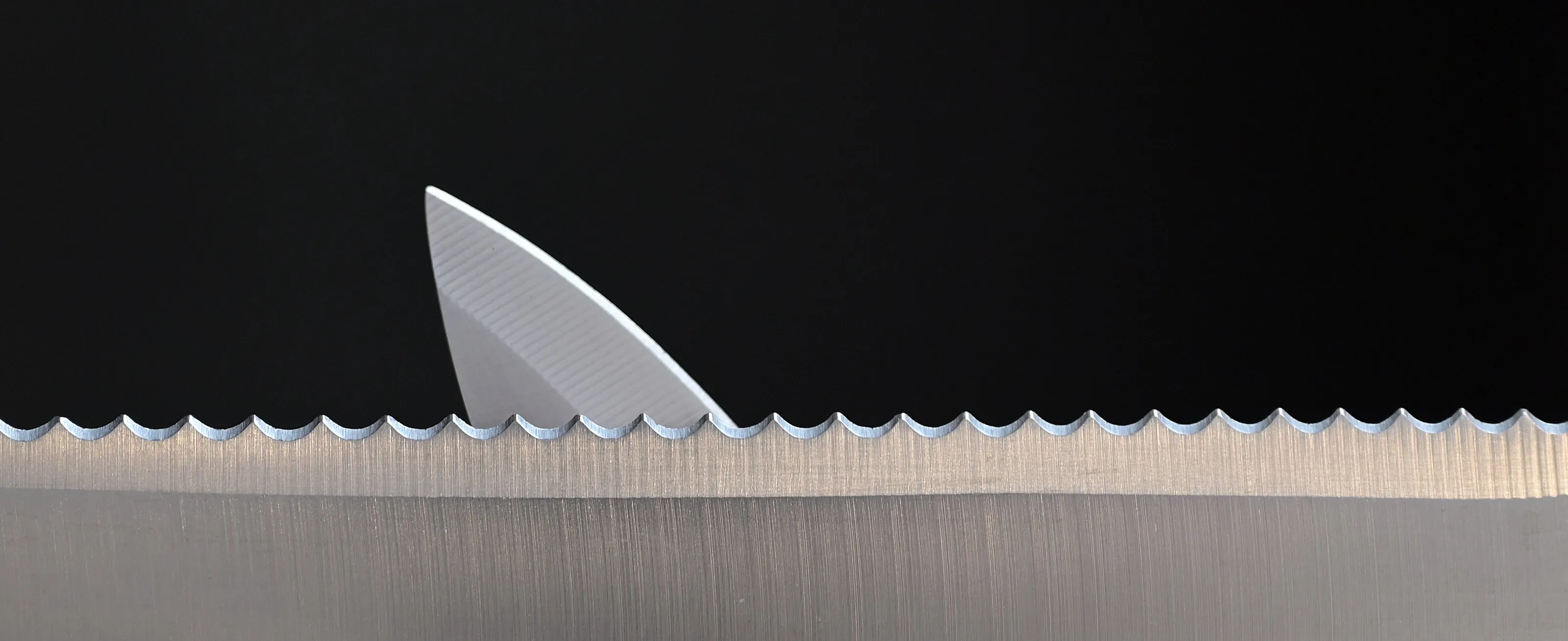
This stack of measuring spoons is nicely composed and the decision to convert the image to black & white removes any potential distractions and helps the viewer to concentrate on the shapes. Unfortunately, the ISO (3200) is too high and the resulting image degradation shows. It’s a nice shot, but might have been improved using a tripod and a lower ISO.


The exposure has been well handled here and using flowers from the garden has allowed the photographer to pick the best, pristine snowdrops. The uniform black background is great – it’s easy to ‘lose’ the shapes of white petals against anything lighter. Unfortunately, the subject is not sharp – the focus is only slightly off, but it’s enough to be distracting. Using a smaller aperture (this was shot at f/3.3) and attaching the camera to a tripod would help.


Before and after, young and old, small and large – showing contrast in an image is very effective. Here the balls have been placed at exactly the same distance from the camera, the background is suitably blurred (thanks to an aperture of f/6.3) and the photographer has adopted a low viewpoint – all excellent decisions that reduce distractions and allow us to focus on the difference between the two objects.


The choice of colours here (red and blue) is great, and the arrangement looks excellent with a nice balance of curves and lines. I’m not sure about the pebbles pouring out of the jug at the bottom though – when you are shooting a still life it’s a good idea to get everything you like in and then start taking things out until you can’t take out any more! Plus, it’s a little too dark for my liking – it would be nice to be able to make out a little bit more of the picture.


Reducing the guitar right down to a mix of flowing lines and basic shapes is wonderful – and cropping in to show a section was definitely the right move. It’s a striking shot and, in my view, could only be improved by including the bottom half of the oval and straightening up the strings and neck a touch. Otherwise, I love it!


Bright, punchy and super sharp, this picture really celebrates the product (in this case nail polish). The cubes are a great addition, and it looks like the photographer has had a lot of fun creating the splatter effect. Using three pots in a triangle works well, with the cubes perfectly placed in between. It’s a masterclass in product photography.


The three key pieces: jug, bowl of lemons and cloth are all perfectly placed - each with a slight overlap and a satisfying variation in height. The shelf is placed in the top half of the frame, which gives lots of lovely negative space for balance. Using flash in a soft box has produced a wonderfully diffused light, which helps to bring out all the textures and forms. Minimalism at its best.


1,209 Photographers

Meet the expert judge


Wine bottles on a reflective base make for a popular still life subject, but the results can be hit-and-miss. Here, it’s hard to find fault – the rim lighting is perfect and gives a wonderful sense of the shape and colour of the vessels, while the reflection is strong without confusing the eye and making the viewer question where to look first.


Brief
See more contest details
Still life photography is the perfect genre to get creative with, since all the variables (usually) are under your control. You don’t have to worry about the changing weather, the mood of your subject, or your friend who is waiting patiently whilst you pause your walk to snap a landscape. Spend as long as you want researching and planning your shoot, then experiment with placement, lighting and composition until the effect is just as you want it.


