


Hi:
A simple image. But you did a LOT of work here. I wanted to commend you for it. You have nice square lines and great verticals. I KNOW how hard that is, and great work there!
Single point perspective is hard... and if I may be crude here, getting it right is a ... you know! If you will excuse my criticism, you did not quite get it right here. The goal on the opposite side should be centered under the blue of this sides goal... and the seats are slightly left of center.
With the great job on your lines, I think you have a lot of attention to detail going on. Getting everything perfectly centered should be foremost in your mind in the field for this sort of photo.
I would also recommend you look at your exposure. I feel that for something like this, an f/stop of more in the 9-11 range would have suited better. with a shutter speed of 1/500, you could have come down a couple here, and taken ISO to 200 with no loss in quality. Minor detail.... but for me, I am always thinking aperture in shots like this....
Anyway, good piece!
Dave


This is a really well done image. I do not mind the foreshortening in this specific image, though I usually dont like that in architecture images. I definitely think the windows should be down a stop or two... and the reflections on the floor definitely should be brought down- use multiple exposures at various shutter speeds and you could have done that.
I know, this is a public place and you probably don't have a whole lot of latitude... it would be cool if you could have used flash to reduce glare, but probably not possible.
However, there are two thinks that do kill this image. If you are going to do a single-point perspective, then you have to do it 100%. Here you are close, but no cigar. The two columns are NOT centered.... so you are not centered.
Second, if you are going to go after the "Empty" theme, you need to be empty. There is a sign to the left of frame.... and one just to the right of the far door.... Those could have easily been cloned out.
You have done a lot of really good things in this image. Your basic composition is great- you just need to look around your frame more and perfect it. You need to look for distractions and remove them.
So very good job- very interesting and fun! But to get to the finalist level you really need to spend more time perfecting the image.
Thanks!
Dave


This is a really fun, cool picture. Based on CONTENT, this is a winner- it makes me ask questions, it tells a story, it is intriguing. It draws me in.
This image fails in the photography. There is no spark. The lighting is flat. The angle is usable, but nothing special. The treatment looks pretty non-existent- was this even run through Lightroom or Photoshop?
I do not mean to be cruel.... this is a great idea for a picture. I just think a lot more work could have been done by the photographer to make this image as exciting as thew concept.


Hey- GREAT job on this! That is a tough exposure- I know, I shoot out at Bonneville a LOT.
Let me ask you a question.... what was coolest about out there? The salt, right? The cool patterns in the salt, the structure of the crystals, etc. Right?
So why don't I see them? Why didnt you get down low so I could really see that salt?
Stop shooting at eye level. Get down on the ground, show me something new and cool, something I have never seen. Excite my eye. Get dirty if you have to-lay down flat on the salt. THAT would have been a lot more exciting image!
Here you have your horizon bisecting the image... which is generally a photo-no-no. I am not going to tell you not to, but I will tell you that does not help this image.
Thanks!
Dave

This is a really good, well thought out image. I like the low view point, the bridge in fore with the bench in the bg. The corpuscular rays make this a special time, and a rare shot. All this is great.
But the treatment of the image is rather flat. Contrast is not wide, and the color is rather subdued. I would venture to guess there is no treatment at all on this image- being an iPhone image and all. That is a shame because a little work on this and you could have a spectacular image.
A low-key image is not bad in and of itself, but the treatment does not go far enough if that was your intention. You could go low key on this shot but a more standard treatment would probably be better here.
I think this image could do a lot better if it had a bit more contrast, and some color work. Maybe even a color shift.
So play with this- I think you will be surprised what a good picture is hiding in this!
Let me know of I can help.
Dave


1,470 Images entered


1,011 Photographers

There were three or four versions of this style image ion the contest. This one was far and away the best. I like it's "irregular-ness" This is a fun image, and very creative.
Therre is a few things you could do to make this better, but they are minor. I think it could use some editing.... color and contrast, but it looks fine as is.
Thanks!
Dave

BRAVO!
I love this- I love the theatricality of it. I love that- while easy to do- you did not BURN the light- you handled the exposure (which could have been tricky) perfectly.
I will be honest, were it me, I would have placed the composition off to the right some and left more black space to the left.... but that is splitting hairs.
This placed first because I think it:
- Is a technically perfect image
- Made me look twice
- Invites me to make a story around it
- Shows incredible photographer involvement; you did not just come across this, you MADE this.
- It shows "Empty"
It all comes together here!
Great job and congratulations!
Dave


Great save on this. I read your story- you did what I always tell people- get what you can with what you got! You pulled a MAGNIFICENT shot from as dreary day.
Processing is great.
I have a comment, just cuz I am THAT guy! :) This works, dont get me wrong. The leading line to your left works real well. But because of the line onto the field at the base of the stairs, I think I would have also tried a single point perspective STRAIGHT down the stairs. Maybe you tried it, I dunno.... and maybe it did not work. ANd this does work. But I would have tried that to!
Great job- I love this!
Dave


79,826 Ratings


So well done, and such attention to detail. It just screams Magritte.... and I love how you have taken his style and not copied it but made it your own.
Now, if you don't mind, I do have a minor criticism. Magritte, at least to me, is all about clean bright compositions. I do NOT mind that this is dark- that works to me.
But I hate the three boats to the right. Especially the red one- such a distraction, something Magritte would never do.
And, since I am obviously going overboard here... the glow of light above your head.... it looks like you added that. Take it back out- to my eye, it is not very Magritte-y either. (Just my opinion!)
Anyway, thanks for entering it in the contest, this was my personal favorite! I really love what you did, and think you have a great skill!
Dave
Brief
See more contest details
Usually, photography is far more focused on what's 'there' as opposed to what's been taken away. Sometimes, though, a composition can be as much to do with what's missing, or the considered use of empty space, than anything else. This is a conceptual brief that we're leaving open to your own interpretation. Good luck, and we look forward to seeing your submissions!
Meet the expert judge


This image keeps coming back at me. Like it likes me! I certainly like it. Your treatment of the light and shadow is great. The color in the window is perfect- very vibrant but not overdone.
But it just doesnt rise to the next step to me- it doesn't speak to me. I like it. A lot, in fact. ANd I really do not know what would make it better.
Thanks!
Dave


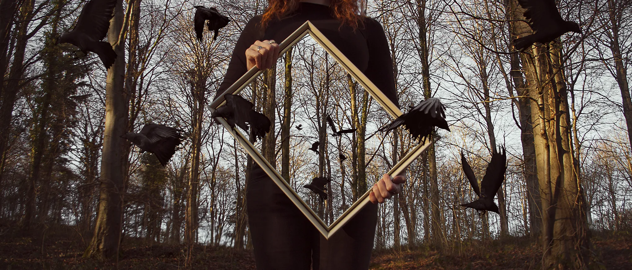
This is a very original take on the empty theme- thats what got you in to the finalist area. This could benefit from lighting, from better staging, from better editing.... but you are winning for SEEING something. That is the most important thing in photography- seeing different. You can learn technical things, you can rent flashes, etc. But you cant learn seeing.
Good job!
Dave

Beautifully composed, extremely well exposed. The tone is perfect! This is an INCREDIBLE picture. I love it.
How does it look in color? B&W is very dramatic, and I bet the color is pretty good, too.
Unfortunately, it is not "Empty" so I wont rate it.... but I had to comment because it was such a great picture!


