

A night shot isn't the first thing that springs to mind when you think of Harvest, but if you live in a rural area you'll be very familiar with combine harvesters and tractors working through the night during August, and this image illustrates that perfectly. The haze created by the dust adds atmosphere, and there is a great balance of shadow and highlights, which tells you exactly what is happening in the shot, whilst leaving a simplified and striking scene. The photographer has controlled the exposure perfectly on what would have been a difficult image to expose for, and as a result has created a powerful image.


This shot went straight into my top 10 the second I saw it. A perfect example of 'less is more' It's as much about what's been left out as what has been included, any hint of background beyond the cranberries would have reduced the impact greatly.
From a technical point of view, the image is slightly soft (which may be a result of it being scanned from film), and the focus point doesn't seem to be on the man's face which I think would have been a better choice, but this image is all about the composition and colour, which are absolutely perfect for me.


The photographer has either been drawn to, or waited for, the light, which is what sets this shot apart. The wide and empty composition is quite geometric, and breaks a few of the often cited 'rules' by having the two focal points at the edges of the frame, with a large empty central area. This is a great example of why rules are there to be broken though. It's the strip of light which ties the image together, almost drawing the combine harvester towards the telegraph pole on the right, and it has the same effect on the viewers eye.


There is a lot going on in this image, yet at the same time it's very simple and graphic. The curves of the harvested crop lead the eye in wonderfully and contrast really well against the straighter lines in the rest of the field. The low raking light adds interest to the middle and foreground, defining and separating the trees. To top it all there is that most coveted of elements by landscape photographers with the swirling mist in the background adding further depth to the image. I might have been tempted to crop out the darker trees at the right hand edge to create an even more graphic image, but they do offer a barrier to the eye from leaving the frame so I can understand why they have been left in.


A beautifully delicate image of the quintessential English barley field ready for harvest. The flow of the heads of barley from the left lead the eye in to the focal point of the poppies, which have been framed into a lovely composition. The shallow depth of field also directs the eye to where the photographer wants you to be looking, with most of the image thrown out of focus into a smooth creamy bokeh. The subtle desaturation of the colours is very effective, much more so than if the image had been over saturated to garish reds and greens. An expertly seen and handled image


This is a beautifully shot late summer landscape, oozing atmosphere and one of those images that makes you imagine being there. Technically it's very well shot, the dangers of flare and burnt out highlights have been very well handled. The composition draws you into the image using the leading lines of the straw, and the touches of first light and early morning mist across the image really bring it to life and make the image. The flock of birds to the right are an initially overlooked detail that add depth of interest. If I were to offer up one suggestion, I would be tempted to crop further into the image to give a little more prominence to the central area where all the main interest is.

There were a lot of hay bale images entered into the competition, which is understandable as they are one of the most iconic images associated with harvest time. Out of them all this was probably my favourite. The image is made by the brooding, dramatic sky, one of those moments of August light we so often get around harvest time. You can imagine the relief the farmer must have had at getting the crop in before the impending rain. A classic landscape, well composed and subtly handled.


This is a beautifully handled landscape. The composition is clever and pleasing. The eye travels right through the image, settling on all the different elements and then back again, holding the interest really well. The softness of the barley in the foreground really enhances the atmosphere, the flare from the sun adds to the image rather than detracts from it, and you can almost imagine the preparations for a harvest festival beginning in the small rural church. When I think of harvest time, it is this kind of idyllic landscape that I imagine.
Meet the expert judge

This shot really stood out from the many other shots of ears of corn because of the bold and unusual composition, and the use of the light. The symmetry of the field adds a sense of importance to the lone central stalk, further enhanced by its difference in colour and the sunlight catching and defining it. It's an intriguing image which suggests metaphors about being different from the crowd and suchlike.
I do feel the image would be much stronger with a tighter crop, the empty sky at the top is quite dominant as it is the lightest part of the image, but adds nothing of interest to the shot. Cropping to just below the light on the wheat field would change the emphasis much more onto the solitary ear of corn. An unusual and intriguing shot nonetheless.


With drones becoming readily accessible for photographers, there are lots of aerial shots around, but it's images like this which really show what can be achieved with them. The vibrant colours and graphic lines have been used to full advantage by shooting from directly above, and inclusion of the harvesting equipment adds scale, balance and context. The fact that the colour is being removed from the top down, reminds me slightly of a test print coming out of a printer and compels you to mentally strip away the rest of the flowers.

457 Images entered
Brief
See more contest details
From the first cuts of grain to the many festivities which celebrate the year’s produce, the story of harvest can be a feast for the eyes! Sweeping landscapes with a subtle tractor trail are of course visually immense, but so is the industrial prowess of farm machinery, the tranquil vineyard lined with grape-pickers, or the multi-coloured celebrations of a harvest festival. Show us your shots of harvest...
280 Photographers
56,602 Ratings


A very nicely shot image, the high key look, saturated colours and mix of greens, yellows with touches of blue all sit very nicely together, but upon closer inspection I think the exposure is slightly too harsh, with a lot of detail lost around the top of the image, which seems more by accident than design. The composition is what lets it down for me though, the arrangement is quite bottom heavy, and the areas that are cut off seem slightly awkward. A little more experimenting with arrangement would have led to a much stronger final image I think.


This is another drone shot presumably, but quite different from the tulip shot in my top 10. This is an eye catching image, the unusual viewpoint and extremely wide angle give it lots of impact, and the strong leading lines and shallow depth of field enhance that further. On the downside the flare from the sun is quite overpowering. Having never flown a drone, I imagine it can be quite hard to avoid this in this situation with the sun low in the sky, but a little work in post production could have reduced the effects. The green spot in the centre bottom of the image could have been cloned out, and maybe reducing the green hue of the main spot of flare would stop it being so distracting from what is otherwise a great shot.


A combine harvester surrounded by a haze of dust in the early evening sun is perhaps the image the word harvest first conjures up for many of us, as was illustrated by the many similar entries. This was the one that stood apart from the others for me though. The subtle tones of the sky, just the right amount of detail in the shadows, the easily recognisable silhouettes and a pleasing composition all make for a very evocative image. Shooting directly into the sun can cause lots of problems, but here it has been expertly dealt with. The temptation is often to reduce the highlights to such a level that the disc of the sun becomes quite defined. Here the photographer has produced a very natural looking image, whilst avoiding it being so burnt out it dominates the shot.


I see this image as a bit of an opportunity lost. The photographer has either come upon or put themselves in a great location for a shot, but I dont think they have made the most of the opportunity. The old tractor lit up in the shadows looks great, but the way it crops off at both wheels seems a little jarring. The main issue for me though is the timing of the shot. The farmer is covering his face with his hand, where a few seconds later the smoke would have been rising up and catching that lovely light. Given it was shot on a 35mm lens, the photographer was quite close to the subject who was presumably aware of them. Asking them to look at the lens and add eye contact may have produced a more engaging image


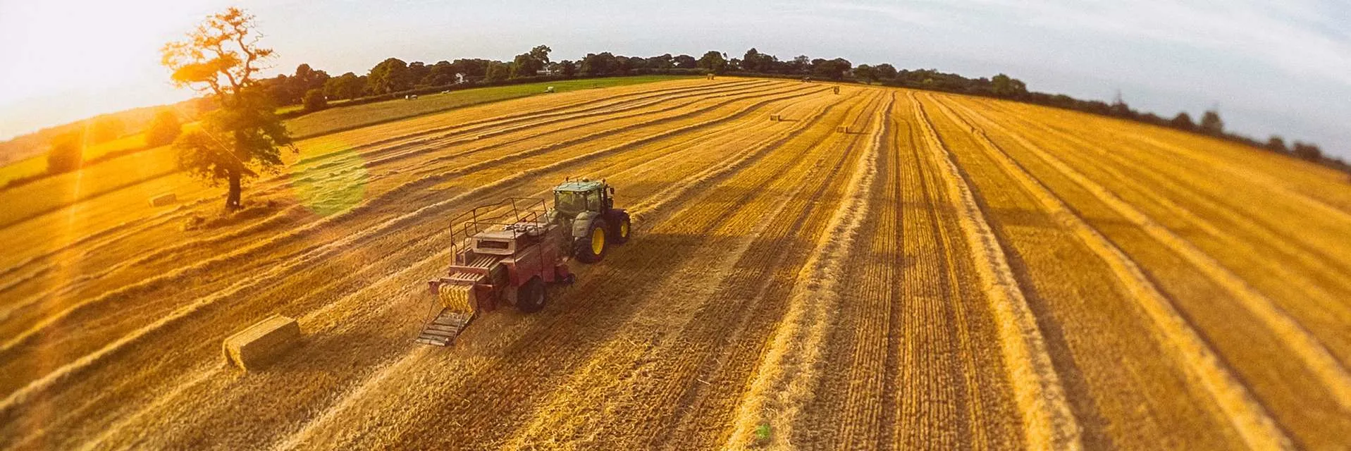
I have come back to this image a few times. It's very unusual and striking. The clouds of dust around the combine harvester add movement and interest, and the subdued colours of the top half of the image are pleasing to the eye. Unfortunately there are a couple of things that jar slightly to me. Although there is no horizon, the image has the appearance of being slightly skewed. The central strip of wheat is almost symmetrical, but not quite. The tractor marks at the top left disrupt the flow of the lines and are quite distracting. The main issue for me however is the green area at the bottom. I can see why it has been included, but it is so dominant that you can't help looking at it. The current crop looks like a 2:3, I think if it was cropped to 4:5 to lose the top tractor marks and some of the green, then skewed to the right slightly I think the overall image may be much stronger.


I think this shot illustrates the importance of cropping an image well. The overall look of the image is dominated by the large areas of burnt out sky, and its hard to look beyond that. The difficulties of shooting into the sun have had a huge impact. On the other hand, there is a great image within the shot, and all that would be needed is to crop much more tightly around the farmer. There is a great sense of movement in the figure, the golden hues are great and the backlit highlight defines the figure perfectly. Cropping much tighter would have added much more impact to the image, the immediate background of the straw and fields would have given more than enough context, and the end result would have been much stronger I feel.


I very much liked this shot, the leaning telegraph poles have been composed thoughtfully and what at first sight might have seemed an unpromising scene has been turned into a quirky and engaging image. For me the processing has ultimately let it down. The blue of the sky seems unnaturally over saturated, and detracts far too much from the rest of the shot. Also the strip of green at the bottom of the image is distracting and adds another colour into the palette. Cropping that off and desaturating the blue would have resulted in a much stronger final image. I also feel this one is a little too far removed from the brief to make my top 10. The wheat is very much an incidental component of what is a very strong graphic image.


