
This is a captivating image of three ladies looking quite unfazed as they casually stroll into the ferocious sea. Whatever time of year this was photographed, the sea in the UK is never going to be actually warm, and I find it rather amusing to see they seem to be wearing gloves! The real success of this image is in the decision to present as a fairly high contrast black and white, as the swimmers are picked out wonderfully against the white surf. I am actually undecided about the presence of the bird - initially I felt this added to the image, but if I hide the bird from view, I now think the image maybe has even greater impact if the focus were only on the three brave souls heading into the water. Whichever way, a great image.


1,110 Images entered

Meet the expert judge

This is a great portrait image of a woman performing her fitness routine. I especially like how you have positioned the camera very close to the action and low to the ground, as we get a sense of being involved with the exercise, rather than just being a passive spectator. A good decision to convert to black and white as it works well, and has been well executed with a good range of tones.


There is no doubting the levels of fitness required here to cling on to some virtually non-existent hand and foot holds in the ascent of this rock face. Being shot at a focal length of only 15mm, I am wondering where you as photographer were actually positioned too! The climber has been captured at just the right distance into the shot, as he is close enough to see the details and his physical and mental effort, but we also get a great view of the surroundings to get a sense of the challenging landscape - any closer and we would have no idea whether the climber was high up the rock face or was just a couple of inches off the ground! Focus, exposure, composition etc all well executed.

A super street photograph, well on brief for this "health & fitness" contest theme. I like the composition and framing, as we can see the action of the children playing, but also get a good opportunity to see their surroundings, as the angle of view is adequately wide to avoid the subjects looking hemmed in. A good black and white conversion, with nice contrasts and a full range of tones from black through to white. Shutter speed just slow enough to capture some movement blur as the girl prepares to kick the ball.

This image captured my attention from early on in the judging. Although the face of the subject is not in sharp focus due to the shallow depth of field, that does not matter, as there is sufficient focus for us to see the intense concentration and mental preparation prior to the lift of the weights. The puff of chalk gives a dynamic to the shot, showing movement to contrast with the stillness of the subject. The understated colouring works well too, as does the square crop and central composition.


For me this image captures the essence of health and fitness, the simple pleasure of a daily run along a beautiful beach, exercise for both man and dog. The amount of motion blur seems just right for the shot, and despite wearing florescent clothing, the colours are not too harsh for the rest of the landscape. I hope your success in this contest has enabled you to feel thankful that this runner "dared" to run in front of your camera, rather than feel angry that they did so, rather than passing behind you. Had they passed behind, all you would have been left with would be a rather lifeless landscape image, rather than a top ten contest entry!

A great image for the theme of health and fitness, as we see a boxer working out in the gym, likely absorbed in music through his earphones to motivate and work through the pain of the exertion. Great choice of shooting angle, low to the ground if not actually on the floor, so we get a great perspective on the sportsman and we become more involved in the action. I really like the muted colour palette which adds a bit of grit to the shot. The limited depth of field provides full focus on the face of the subject, with all other details gradually falling away from focus. Being critical, I may be tempted to desaturate further the pink/red on the base of the training shoe, as once spotted it becomes a little distracting. A minor point though, as this is a great image.


I really like the raw energy you have captured here between the two fighters. The black and white conversion has worked really well with a good range of tones, and the darker shades of clothing on the fighters allows them to stand out well against the background. Shutter speed of 1/200 is spot on for me, as there is just enough movement blur to give a sense of the action and avoid a shot looking too frozen and static, but the faces look sufficiently sharp to enable the intensity of their stare to be seen.


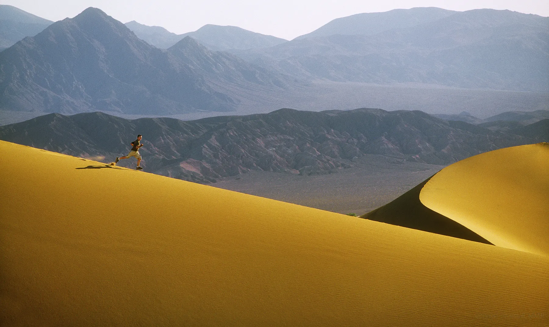
It is easy sometimes to look at images such as this, and not truely appreciate the skill of the photographer who has not only had to consider all the technical photographic elements for a great capture, but needed to achieve much to be in that location to take the image in the first place. It is also easy to look at an image such as this and understand why some people put themselves through such physical effort and exertion, as they are often given the greatest rewards to experience such wonderful views of nature. The size of the figures in the frame is perfect, large enough to be clearly seen, but small enough to give a sense of the awesome magnificence of this stunning landscape. The image could obviously have been improved a little had the highlights from the sun not been burnt out, but that does not matter for me, as otherwise the exposure is spot on, you have captured a real sense of the place and the action.

710 Photographers
38,837 Ratings


Brief
See more contest details
Fitness photography is one of the fastest growing niches there is, helped by the rise of social media influencers. Compared to sports photography, fitness is a little more conceptual with more potential for staged moments. “Health and fitness”, as a subject, covers most sports – from gymnastics to martial arts – but can also include foods, plants and many other categories, so don't be afraid to get creative.

This entry shows all the elements for a great image - a clean white backdrop, crisp healthy foods in bold contrasting colours and some natural lighting. Where I think the image could be improved is by altering your viewpoint and moving in closer for more creative and dynamic shots. You have selected a wide aperture which would lend itself to more creativity with a shallow depth of field, and if you move in much closer to the food this would allow the subject to fill the frame, rather than a plain table and chairs being very obvious and rather dominating the scene. Composition and set up of the different elements is always tricky, as just an inch to either side can make or break the shot. I encourage you to experiment with a similar set up, and take multiple shots from different angles, closer in, adjusting the relative position of each element every now and then. Have fun experimenting, and you should be able to capture some wonderful and tempting food photographs.


This image is close to capturing the moment, but not quite. I appreciate how difficult it can be to capture this type of image, as the action is quite unpredictable in terms of how high, how far, etc. This may have been a one-off grab shot as you were passing by. However, if you were there for a while and the boy was repeating his somersaults, where I think the image could have been improved would be by a slight change in the position of the camera. If the viewpoint had been from much lower to the ground, the boy would appear in clear sky, giving the impression of being higher, and having a completely clean background surrounding him rather than his head being against the sea and grass. Nice attempt, and great potential.

This image has all the ingredients for a great image. The image looks to have been photographed using a flash, as there is a harsh shadow cast behing the food blender and the colours have become a little harsh. With indoor set ups such as this, even without a tripod, there ought to be opportunity to place the camera on a solid surface for support, which would allow a slower shutter speed to be selected to avoid the need for a flash. I would be tempted too to pull the elements a little closer together for a tighter composition, maybe even creating a square crop. Great potential, worth experimenting with a tripod or other support, and experimenting with no flash for softer, more diffuse lighting.


I appreciate this image was taken on a moving ship so it may not have been completely steady, however what could have been a super image is let down by the tilting horizon. It should be possible to correct this very simply in photo editing if the original capture was a little askew. You obviously have a good eye for a photograph, with the lone figure captured on deck, but sadly the tilted horizon means the image cannot be awarded.


I am puzzled by this image. It has some great potential, but I wonder if it has accidentally been uploaded the wrong way around - in landscape rather than portrait orientation. If that is the case, I recommend quickly checking all uploads being entered into a contest, to check it looks as you intended. If incorrect, it is very easy to rotate the uploaded image. If you did not make an error and intended it to be this way, I am afraid I am missing the reason why. Where I think the image could simply be improved would be by turning it to portrait orientation, and cropping off everything above the level of the yellow wall. This would leave a strong, fairly abstract image which would certainly have attracted my attention for the right reasons. A shame here, as there is a great image hiding within this photo.


This is a great image, shot from an unusual perspective, which strengthens the initial impact of the shot. The inclusion of the mirror reflection is a key part of the composition, but unfortunately that is where the image is slightly let down, as we can also see the reflection of the photographer in the mirror, camera to eye. It is such a shame, as either with a slightly different angle at the point of capture, or with a slight crop in post-editing, that could have been removed, and then only objects or people expected to be found in a gym would be in shot. Otherwise a great image.


