

There were lots of artists version of this ceiling in the competition but this was one of my favourites. The brightest part of the image is in the centre of the frame which draw the eye. The darker areas around the edges help to keep the eye within the image frame. The colours give added interest to the image.
My compliments to the artist on a really high quality image.

A really lovely image that demonstrates the effectiveness of using the HDR technique within dimly lit environments. My only issue with it is that the framing in unbalanced. This is something that was apparent in many images submitted in this competition. Look at the candles on the altar/table; they are not equidistant on either side of the archway beyond and it is this that gives the impression of being unbalanced.
When framing images look for visual clues that help you determine if your framing is balanced. In this instance check the candles are a similar distance each side of the archway. It isn't always possible to get everything lined up perfectly, but in a competition of such high quality images it is small aspects like this that can make all the difference to being in the Top 10 or being Commended.

The main subject, the man reading the book is wonderfully framed by the gothic window.
While part of the mans robes are burnt out by the sunshine this doesn't detract at all from the image, in fact it draws the eye to the main subject.
Once again a limited colour palette has been used; reds, browns and greens, all work together to create a harmonious, relaxing image.


There were a lot of images in this competition that I could easily make a case for being awarded as to the winner, so why this one?
I am fairly sure it is a composite image and as a photographer I am naturally drawn to images that have that 'in camera' look rather than composites. However this image has some beautiful qualities and has been so well done that it has an appeal that made it really stand out.
I love the muted background wall with its scrolling patterns and islamic lettering and the way the two figures in black contrast so well against the wall. The rays of light falling across the image from the top right corner give dimension and interest to the scene. Finally the poses of the figures are really in keeping with the scene. The figure on the right facing and touching what could be a sacred wall while the figure on the right is knelt down, palms outstretched in prayer.
To me it shows the links between all the world's great religions - this could be Jews at the Western Wall or Christians at a statue of Christ on the cross, or even Muslims at Mecca; all worshippers feeling the need to reach out and touch their holy places. In a world where religion can cause so much division, to me this demonstrates that we are all fundamentally similar.
Having an image that stimulates so much interest and thought is really what art is all about.
So well done to the artist for crafting such a wonderful image and a worthy winner of this competition.

This composition was a very popular one in this competition with many photographers submitting their version of this view of York Minster ceiling. It certainly draws the eye and is a difficult subject to photograph well, as it requires mastery of various techniques and I think this artist has produced the best version ...... in my opinion.
Firstly composition - the composition has been nailed. There is a symmetry to this image that was lacking in many of the others and I must add to many of the other images submitted in to this competition. The artist who created this image has made minute adjustments to ensure the windows on the left and right are of similar heights. Also the same with the window at the top of the frame and the stonework at the bottom, both are consistent in size which adds to the overall symmetry of the composition.
Next is the HDR rendering. Often when creating HDR images the software used can cause some unnatural colour shifts, one of the most noticeable is giving the windows a blue or turquoise cast. This looks totally unnatural and can be corrected in processing. In this competition too many artists allowed the HDR software to control their final images which created unnatural colours rather than taking control and correcting these aberrations.
Alongside the overly blue windows HDR can turn the stonework an unnatural shade of yellow but the artist here has worked hard to correct this and ensure the stonework is rendered more like what they saw with their eyes at the time they made the image.
Correcting the colour casts induced by the variety of different lights within these grand places of worship, is another test of a photographer's post processing skills. When I photograph in places of worship with mixed lighting I use an ExpoDisc which are available from many good photographic stores. This simple device fits over your lens, you take an exposure and then use this to create a custom white balance for future photographs. It isn't a perfect solution but it gives me a good starting point from which to make my corrections.
Finally with HDR images we can be left with an overly sharp image, something that looks as if we reached out and touched the screen, we may be in danger of cutting ourselves. Now this effect can be great for creating certain types or styles of images but for my tastes this artist has toned down the sharpening effect to something that looks more natural.
So my congratulations to the artist who has shown their mastery of many photographic techniques in the creation of this image.

This image made it in to the Top 10 due to the quality of the processing and demonstrates a mastery of the technique known as HDR (High Dynamic Range).
Basically it is a technique where several different exposures are taken, each with a different exposure time to capture detail in all the shadow areas and all the bright areas. These images are then blended together to give us one final image which doesn't contain any blocked up shadow areas or burnt out highlights. Church interiors are perfect places to employ this technique.
I feel this artist has created a lovely, balanced image which contains so much detail we could spend hours looking at everything with the composition. The brightest area is still the window, which it would have been when the exposure was made and the darkest areas would be around the structure at the end of the aisle. So not all contrast has been lost which is a good thing.
The main reason why I have chosen to review this image is for the one problem area I have with it and for that matter many of the images that were submitted to this competition. That of converging verticals. Look at the uprights at the side of the church and how they seem to lean in as they rise to the top of the frame. This is due to the artist pointing their camera upwards, obviously to get more of the grand ceiling in the frame. Conversely if the artist had pointed their camera downwards then the uprights would appear to be converging towards the bottom of the frame.
There are a few ways to correct this issue.
- Use a wider angled lens.
- Turn your camera into portrait orientation and then take a panorama of the scene.
- Use the correct tools in Photoshop.
I personally turn my camera into portrait orientation ensuring my framing contains as much of the ceiling as I want. I then frame the left side of my image and take my series of HDR images. Then centre my camera and take a second set of HDR images, then frame up the right side of my image and finish off my HDR series of images.
In processing I create three HDR images, one of the left hand side, one looking straight down the church, then one of the right hand side. These final three HDR images are then blended together in Photoshop to create my final image which is then cropped to suit my needs.
Winter is a great time to get out and try these techniques as the churches are quiet after the Christmas season. So get out and practice, it is great fun mastering new techniques.
2,830 Images entered
Brief
See more contest details
Hallowed spaces, often intricately crafted and beautifully decorated, and at the service of worshippers, wedding parties, mourners and tourists alike. A huge variety of architectural and decorative styles and ornamentation exists across and even within the world’s religions, and all will no doubt be on display in this contest.


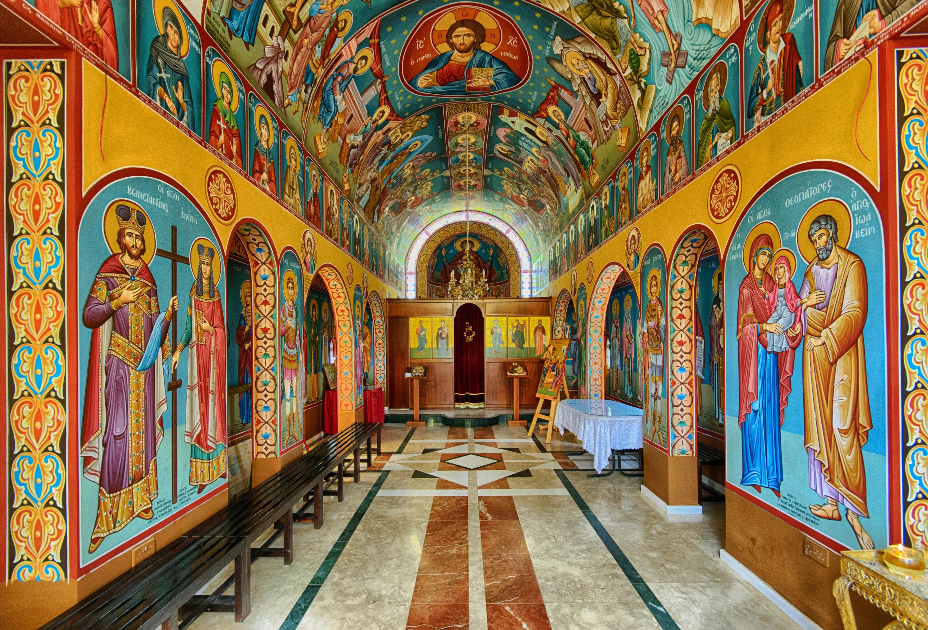
The colours blue and yellow always work well together as they are opposite on the colour wheel which means they compliment each other. The artist has controlled the highlights really well while not allowing the shadow areas to become too dark. The composition is really good too with the arches sitting nicely within the frame.
A lovely balanced image of colour and shapes.


1,514 Photographers

This is another image I really like but with only 10 images allowed in the winners it didn't make the final cut. I love the framing of the window with bodies which seem to be heralding the dove of peace. The main subject is sharp while the figures appear to be slightly softer, this confirms that the window is indeed the main subject.
In the end I decided that there were other, stronger images and so it dropped out of the Top 10.

Another image of York Minster ceiling. This is a high quality image and came very close to making the Top 10. The stone ceiling is beautifully rendered. The composition has been really fine tuned. My only concern is that the HDR process has caused the clear glass in the windows to render as turquoise blue. This is either a result of the HDR process and can be corrected in processing. Or it is a result of increasing the saturation in processing.


Meet the expert judge

