Get notified of their new contests


There were a high number of top quality images in this contest, and deciding the final placings was difficult, having to whittle down from an initial 28 images in my top ten! This was my eventual winner. What I like here is how the image perfectly combines both documentary and abstract. The way the image has been composed and framed, presented in a square crop, shows the architecture of a series of shapes, lines, colours and patterns. Focus on the structures is sharp, which allows a lot of detail within the architecture to be seen, so we can get a real sense of the magnificance of the building. The HDR effect helps balance the light, and whilst there is a range of tones, neither shadow or highlight dominates. You have also done well to retain richness in the colours without them becoming over-saturated. Congratulations on your winning image.

It is difficult sometimes in judging subjects such as architecture, to ensure the image is judged not on the quality of the architecture, but on the quality of the photographic representation of the architecture. Here both are amazing. The archecture is obviously stunning, but the way you have captured this fine basilica shows it off at its very best. The use of the wide angle lens, taken pointing directly upwards, has enabled a great amount of detail to be packed into the frame. The colouring of the shot brings a feeling of light and lightness, which again reflects the magnificence of the building. Superb image, well done on your top ten placing.
1,519 Images entered

I really like the mood you have captured in this image, of the darkened interior of this ancient monastery with its beautiful architecture and stunning frescoes. There is no camera shoting details attached with this image, but I imagine the shooting conditions were quite challenging, with little light available and very dark colours within the architecture. There is just enough illumination however for the colours and details to be captured, and everything looks to be in sharp focus. Great image, well done on your top ten placing.
Meet the judge

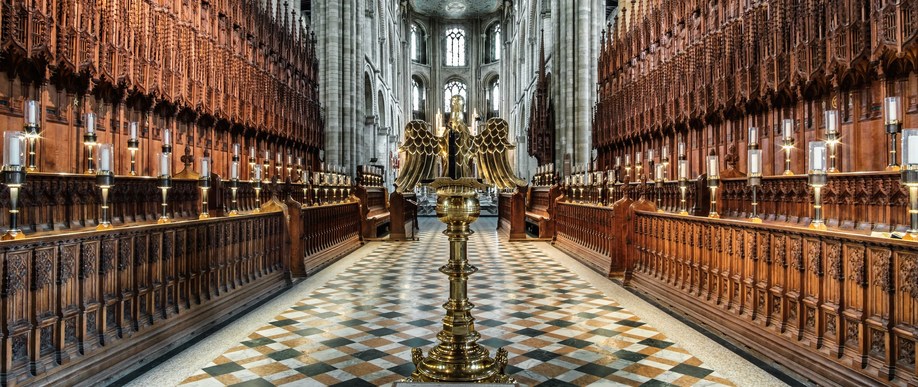
This image has a strong initial impact. The central line on tbe wonderfully patterned floor acts as a strong lead in line, which pulls the eye into the shot. You have done especially well to ensure the scene has been shot directly head-on and the composition is perfectly symmetrical, which works well with this type of architecture, where just an inch or so out either way could spoil the overall effect. Although shot with an extreme wide angle, there are no distorted uprights, and the exaggerated perspective on the floor in the foreground is a strong feature of the image. The HDR treatment has been well handled and suits the subject. Colours are rich but natural and there is no hint of any colour cast which can so frequently mar many internal shots. Congratulations on your third place finish.

Brief
See more contest details
In this contest I am looking for your photos showing the inside of a religious building. Your image can show any religious building from any faith, religion or country. Examples include churches and cathedrals, mosques, temples and synagogues. You could capture a wider view of the building interior, or maybe focus more on the architectural details. Whichever you decide, it should be obvious that the building is for the purpose of worship, and the images must be captured from the inside of the building. Entries can be in colour or black and white. I look forward to seeing your entries.

Although this image shows a relatively small part of this cathedral, the composition gives a real sense of the scale and magnificence of the architecture. Although the image is quite dark, especially on the lower sides, there is somehow a feeling of lightness about the shot. So many intetior shots in similar buildings are spoiled by a heavy yellow colour cast which can look oppressive, but here the white balance looks accurate, presenting a very realistic scene. Composition is spot on, and you have captured a great amount of detail. I may have been tempted to slightly lift the dark areas on the sides of the lower part of the photo, as to me they are a little distracting, but still a great image, well done on your top ten placing.


There were a number of images of cloisters in this contest, and some would debate whether they are an interior or exterior feature of the building. Here however, the cloisters look to be fully enclosed, making them, in my view, completely on brief for this contest. What initially drew me to this image is the incredible detail you have captured in the ceiling architecture. The black and white conversion has been done very well, with a full range of tones from black through to white, and without the distraction of colour we are better able to focus attention on the multitude of shapes and patterns which this image presents. Great work, well done on your top ten placing.

936 Photographers

51,962 Ratings


The strong composition is an immediate draw to this image, and great care looks to have been taken to keep everything centered and symmetrical, which is vital for the success in a more abstract, graphic shot such as this. The light has been well captured, creating a lovely mood, and all the details look fantastically sharp. With this image, I especially like the colour contrasts between the warmer golden hue of the stonework, and the cooler blues of the glass. Great work, well done on your top ten placing.


In the image details, you have commented on the person who would not move from your shot. However for me, the inclusion of the figure makes the shot, especially the pose you have captured, which seems to show the awe and wonder felt when standing inside such a beautiful building. It also gives a sense of the height and scale. Well controlled exposure, balancing the light through the stained glass, the artificial lighting, and the more shadowy areas of the scene. Being picky, I may have been tempted to nudge magenta-green tint slider down a little, as the image may look a little too pinkish, especially on the floor, but that is a minor issue. Great work, well done on your top ten placing.


This type of extremely exaggerated perspective may not be to everyone's taste, but with this subject I think the wide angle has been used effectively and produced a dramatic image with an abstract feel. The more-or-less monochrome finish also works well, as we are able to explore some of the wonderful shapes and designs in the architecture without the distraction of colour. Everything looks symmetrical and well aligned, not an easy thing to achieve when using an extreme wide angle, but important to strengthen the overall effect of the shot. Congratulations on your second place finish.


This image is for me just on the border of what I personally feel is too extreme a use of HDR, but the details the process has revealed is amazing and I felt the image deserved to be placed. You have chosen a great viewpoint, as there is good perspective and depth to the scene as we can see along the aisle into the distance, and also a huge amount of details all around for the eye to explore. The inclusion of the flags strengthens the image, as there is good colour contrast between the blues and yellow/browns, and the softness of the fabric contrasting with the hard structures of the architecture. Super image, well done on your top ten placing.


