Inversion of Tones or Colours
HiekeH

Inversion of Tones or Colours

October 2022

Get notified of their new contests

Show the judge some love...

Great contest!

Very nice effect. This is a piece of art with a combination of the look of an oil painting and an image cut out from paper. This is a great example of conceptual art, produced in a very nice way.

Entry 14217525
172nd
13

What a great effect of the editing. This picture stands out because of it's powerfull simplicity. I would frame it and hang it on the wall. Or maybe even better: how about printing wallpaper from it? It would make some awesome decoration.

To be honest, I'm not sure how to rate the original (seems edited a lot and hence the inversion might not be the only edit it benefits from) but since I like the end result, this pic ended in the top 10.

I love this image very much. The few colours, strong lines and light... I would print this on a large aluminum (dibond) plate and hang it on my wall. Just awesome! I wish I created it myself. Very powerfull image.

Wow, this is a very strong image because of it's simplicity. Very minimalistic and abstract. I wish I'd made this photo. I love this flower that looks like a human eye. Frame it and put it on you wall! And thanks for the inspiration.

Entry 14218086
51st
4

Wow. This is abstract art. It keeps grabbing my attention. Every time I look at it, I discover something new. Great colours and lovely composition and layering. I would print this on a large surface (aluminum/dibond) and put it on my wall. Oh and I would certainly make Christmas/New Year cards from this picture if it was mine :-)

I love the result, but because I'm looking for images that benefit mostly from the inversion and don't rely heavily on other edits, this is not the winner of the contest.

Great picture. The person watching it can project so many things on it... But even if you don't there's enough to enjoy here. Strong effect with just a few elements. Well done.

Entry 14219329
69th
19
Entry 14219882
309th
2

I love the way my eyes are led through this picture. First the big picture of coloured areas, then the contrasting smaller parts and then the conclusion that it's a butterfly! Lovely. It's a piece of art. Inversion added a great effect here. The picture looks unsharp and seems to have a lot of noise/grain, but it adds to the artistic effect in this case, if you ask me.

To be honest, I'm not sure how to rate the original (seems edited a lot) but since I like the end result, this pic ended in the top 10.

Fascinating image. I'm not sure about the line, that gives it feeling of a funeral announcement to me. But the rest is just lovely. I wish I created this. Frame it large and put in on your wall!

I love the minimalistic abstract effect here. A very graphic image. It's subtleness is powerful. Just a few lines and a few leaves that come out better without a lot going on. I also like the use of negative space here.

Inversion made this generic photo stand out as a piece of (Japanese) art.

Entry 14220695
270th
18

Awesome image that I can can keep looking at and even after watching it over and over again, I discover new layers. This is a great piece of black and white abstract photography. Frame it large and hang it on your wall!`

The original was great, the inversion is amazing. The inversion does add a lot, but don't impact the photo as much as with the pictures that ended higher on my list.

Lovely graphic piece of art.

Although it's not what I was looking for, I like this image because of the light, water paint kind of feel it has. The actual subject is not the subject anymore. This photo gets an extra level by converting the colours/tones.

Subtle photo that makes your eyes stick a little longer.

I love this abstract piece of art and wish I'd made it myself. Lovely how my eye first saw abstract lines and then the chair it comes from. This could be easily hanging in a museum... Frame it large and hang it on your wall!

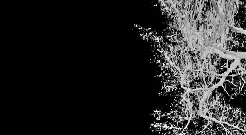
I love this abstract piece of art and wish I'd made it myself. It looks like one of my pictures actually. Great balance of big and small branches and the depth that those sizes give to the image. I'm wondering if it would help if the blacks can be made a bit deeper to freshen it up. On the right side it looks like very dark brown now. But other than that: frame it large and hang it on your wall! It's a very powerful image.

Entry 14223685
30th
4
Entry 14223778
421st
56

Nice abstract image! I still don't know what I see after reading the explanation and I like that. The colours and lines pop from the screen.

This looks like abstract art. Lovely! Great composition and colors. Frame it! Large on alu dibond or some other fine art print with very sharp and deep colors. It pops off the screen and will look great on the wall.

Great and funny concept and title.

Entry 14224305
7th
66

Wow, great colour combination! The inversion really ads something to the picture. For me it's too figurative, but compliments anyway!

Entry 14224566
300th
9

This is abstract art to me. Lovely how you play with light, colours and inversion here. Frame it large!

Entry 14224568
44th
4
Entry 14224570
297th
10

Art! Love it. Frame it large.

I like how inversion influences the photo. It has an alienating effect. Well done. It was not what I'm looking for (I prefer images with less recognizable subjects) but I wanted to let you know that I like what you did.

Entry 14225321
409th
10

This is a lovely piece of abstract art. I love it's minimalism. Powerfull image. My eyes are drawn to it. I'm just curious how this will look when the dark brown background is fully black; that might be worth trying. I think it will give this image a slightly fresher look that would suit it very well. And frame it large!

Entry 14225438
5th
33
Judge
winner

I LOVE how the inversion makes this photo such a different piece of art than the original must have been. It looks like a water paint with pointillistic and abstract influences. It's powerfull because of the few elements it has. Those main subjects stand out because they are in colour. The blue, black and white of the surrounding buildings make it just perfect to balance the composition.

I would certainly put this on my wall, printed big on aluminum (or dibond).

235 Photographers

500 Images entered

Entry 14225441
8th
13
Crowd
winner

Brief

See more contest details

Show me your best photos which have either tones or colours inverted. As an example, in a black and white photo, black areas become white and white areas become black, looking similar to a negative image. The contest is only for images with tones or colours inverted, not images that have been flipped or rotated. Please try to make sure the inversion really adds something to the photo, preferably making it a look like a piece of art. Entries can be in colour or black and white.

16,599 Ratings

Meet the judge

Lovely image and colours. The curls on the bottom make it stand out from similar pics.

Entry 14217458
13th
64

Wow, the inversion created a water paint like picture with a paper cut effect of that white boat with people in it.

Frame this - it's a great picture. The simplicity of those 2 colours and the alienating but recognizable result makes this a very strong image.

Entry 14218457
66th
12

Very powerful image, but when inverted, the result looks quite similar. To me the inversion entered in the contest doesn't really add something to create an original effect, although I do like it much more than the original would've probably looked like. Also... The background is a bit distracting, it might help to darken the pink trees (?) and the cars to bring out the subject on the foreground even more.

Entry 14218551
31st
19

Lovely picture, but not what I'm looking for.

Entry 14218730
32nd
20
Entry 14218808
493rd
12

I love this minimalistic, powerfull image.

I love the fact that this figurative subject is depicted in such a nice abstract way. It's a very subtle picture that you can look at for a longer time.

Entry 14220696
374th
15

Original concept and lovely image. A bit too recognizable for my taste, but please know I was inspired by this. Lovely to print this on a large aluminum surface and hang it on your wall.

Entry 14220820
29th
6
Entry 14220859
34th
9
Entry 14220873
49th
64

Even with the explanation it took me a white to see what it is. And I love that about photos. Strong image, the inversion really added something here.

Entry 14221370
20th
39

Strong image, I like it. It was not what I was looking for (I'm looking for more abstract pictures), but wanted to give my compliments anyway. It could be a very luxurious special disco, sauna or something like that but it's a mosque! The inversion really ads something to the photo.

Entry 14221898
438th
2

Nice abstract picture. I love framings of small pieces of something larger.

Entry 14222088
57th
11

Love the alienating effect of this picture.

Wow. The inversion created a very special effect. Dreamy, fairy tale like... Frame it large!

Entry 14223699
52nd
4
Entry 14224274
70th
51

Just lovely. Personally I would prefer a version without the person, to make it even more abstract and about the lines and colours. But well done anyway.

Entry 14225440
22nd
20
Entry 14225443
28th
13
Entry 14225545
41st
7
Entry 14225852
331st
9

This looks like an explosion of red ink until you see the buildings on the bottom. It's not what I'm looking for, but I wanted to let you know I love it anyway.

Entry 14226875
33rd
46

This inversion adds something. I love the dynamic effect of these few colours and lines. Well done. It's not my favourite in the contest, but please know I like it.

Entry 14227058
164th
25

I love the graphic look and feel of it.

I love the oil on canvas look of the coloured part in combination with the paper cut look of the white/light part.

Entry 14228015
476th
1

I have no clue to what this is. And I love that. It's a mesmerizing picture and it looks like abstract art. Very nice.

Entry 14228369
113th
52

I love the oil on canvas look of the coloured part in combination with the paper cut look of the white/light part. Also a very nice juxtaposition of the vertical lines of the coloured part and the horizontal line of the white part.

Entry 14228408
24th
54
Entry 14229173
386th
40

Lovely! Abstract, playful, original... This is a genre I like. The inversion really adds something here. Because other images made more impact on me, it's not the winner of my contest. But please know I do love this image.

Entry 14229345
40th
8

Did you see this in your sleep? ;-) It's a great picture, very dreamy. Or fairytale like. I like it's subtlety. It's worth printing this on a large surface and hanging it on a wall. Maybe above your bed? Haha...

It seems to me (but correct me if I'm wrong) a composite of a double exposure in which the tree is inverted and the moon kept as is. Hence it's not on brief.

I love this abstract photo. Minimalistic and very powerful. Less is more indeed. The colors make for a special combination and together with the lines, forms and texture they produce some special art.

To be honest, it looks like the red stripe was painted onto the canvas later. And so does the red in the right bottom corner. I'm not sure if this is part of the original photo or that it has been edited in. Normally I would disqualify such a picture, but I'll give the benefit of the doubt.

Please correct me if I'm wrong! This way I can learn.

Wow. This is art. I really love it. Those colours! Inversion really adds something here. And it has a water paint look to it too... I would print this on a large surface and hang it on my wall. Well done!