
Perfect technical control of exposure and colour have given this image first place in the competition. It is a simple image, but there is so much to look at, and I love how the horizon disappears while the three buildings are perfectly sharp and still. My only niggle is the image isn't quite straight, if the bottom of the three buildings were levelled it would make the image flawless.


It's rare for me to say that I would hang an image on my wall, but I would love to see this in my living room. It is utterly incredible, and to be honest, I'm a bit jealous it isn't one of mine. Colour is gorgeous and the light, in the apparent lack of light, is superb. The only reason why this photo didn't win the competition is I think the crop could have been a little tighter from the left top corner, just removing some of the less interesting area on the left and a fraction from the top. I just find my eye keeps wandering over there, and there's nothing there. Congratulations, and you've made me want to go to the Faroe Islands.


I've been to the Lofoten Islands myself and spent many hours photographing this kind of boulder littered beach. Not sure if this is Uttakleiv, Unstad or another. It's a great shot wherever it is and it really drew my eye. The simplicity of composition, the colour and mood are great. The one thing that niggles me is the one angled stone near the bottom left edge; it's more the gap between the edge of the stone and edge of the frame. My eye keeps being pulled there and I don't think it serves the image. Maybe a different crop might help the simplicity of the image.


1,196 Images entered

Meet the expert judge


Brief
See more contest details
***This contest is open to subscribers (members on the Challenger, Pro and Master subscription tiers). However if you're not a paying subscriber you can still purchase entries for £2 (GBP) per image.*** Unlike a traditional landscape shot, long exposure images are more dynamic, giving us a view of what a landscape looks like over seconds, minutes or even hours. As complicated as it sounds, it can be unexpectedly straightforward to capture photos with a slow shutter speed, but it’s important to do your research first.
408 Photographers
29,950 Ratings


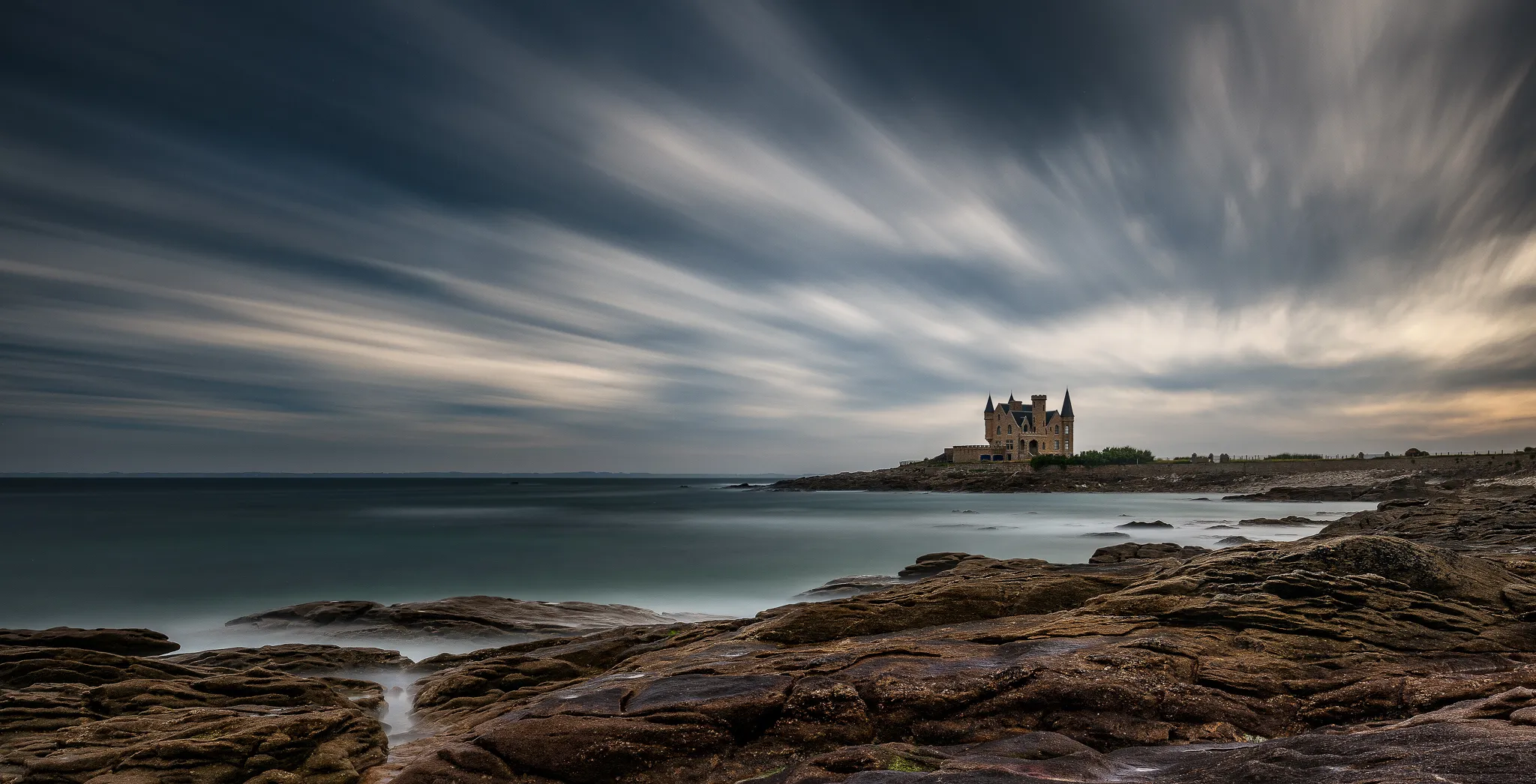
I really like the strong composition that the photographer has chosen for this scene, and the resulting photo completely fulfils the brief for a long exposure landscape competition. The sky is amazing and really draws the eye into the image. There are a couple of tips I would give however that could have made this photo a little better and would have given it a higher result in the competition. Firstly the bright highlight in the sky is too overexposed and the detail has been lost. Because it's so bright it has now become the focal point of the photo, when the building really should be. Secondly, there are a couple of lens dust spots on the panel at the bottom left. These tend to show up when using a small aperture and are easily removed in post-processing.

I really like this image, the tone and line of the long exposure waves breaking over the beach rally draw the eye through the picture to the distant landscape. This image, however, would be very much stronger if the top third was cropped out. The flat expanse of the grey sky does nothing for the image. Please watch out for sensor dust spots which are visible in the sky. These are visible when shooting at small apertures and are easily removed on post-processing. A sensor clean might help too.


A classic shot from one of Scotland's amazing landscapes. Your exposure is handled very well and the trails of clouds across the sky really help to draw the eye into the scene. The only snippet of advice I'd give to lift this already great image to the next level would be to resolve the issue with the stone in the bottom left corner. I find my eye keeps getting pulled to it, and it doesn't serve the composition. Maybe a crop in from the bottom to make a more square image would help.


I really enjoyed this simple yet engaging image. Many would have converted to black and white, but it's refreshing to see this colour version. Even the red dot on the left horizon adds a touch that I like. There are in my opinion two small things that could make this image a little stronger. The gravel beach in the foreground is distracting and doesn't add anything to the image, so if this was mine I think I'd crop that out. Secondly, I would have aimed for a little more separation between the top of the wooden structure and the horizon. Setting the tripod 30cm higher or lower would have helped I think. Thank you for entering and better luck next time.


