


Another really lovely image that has been done very well, for me and again this may be a subjective matter, but I find the very dark bugs very distracting against the very bright green, coupled with the fact I am struggling to see exactly what they are was the reason why this only made it as far as highly commended, as other than that the detail-rich straight lines and really well-balanced exposure across the whole leaf is spot on.


I really loved this image and it was so close to being in the top 10, but I had a tough job deciding what was going in and not, the only bits that I found my eye were pulled to in a negative way were the top left corner as it seemed a little bright and a bit of the frame/structure on the 1st line down just right of centre, my eye just keeps getting stuck to that, a little bit of work in the post could have solved that issue and it would be a bit less distracting. But other than that I really like the depth, the balance of the rest of the light and the detail retained in the structure as it flows through the shot.


Now, what is not to love about this image, to start with the subject is just stunning and really well lit, the composition works very well and the shot itself is just quirky and I love it. For the brief, the parallel lines work so well as they just run through the image in a well-considered format from the top to the bottom of the frame and over the model. From this, it looks like you are really comfortable working with models and lighting and it was nice to see something so different entered into the competition.

Really well-taken image from the composition perspective. I just really like the way the lines take you in from the bottom of the frame and criss-cross all over the shot but still manage to remain structured as well. I think the only thing I would change with this is getting rid of the border you have added, as the image you have taken is so clean-cut and looks out of place. Other than that really well done and it was definitely worth the walk to the end of the platform to grab this shot.

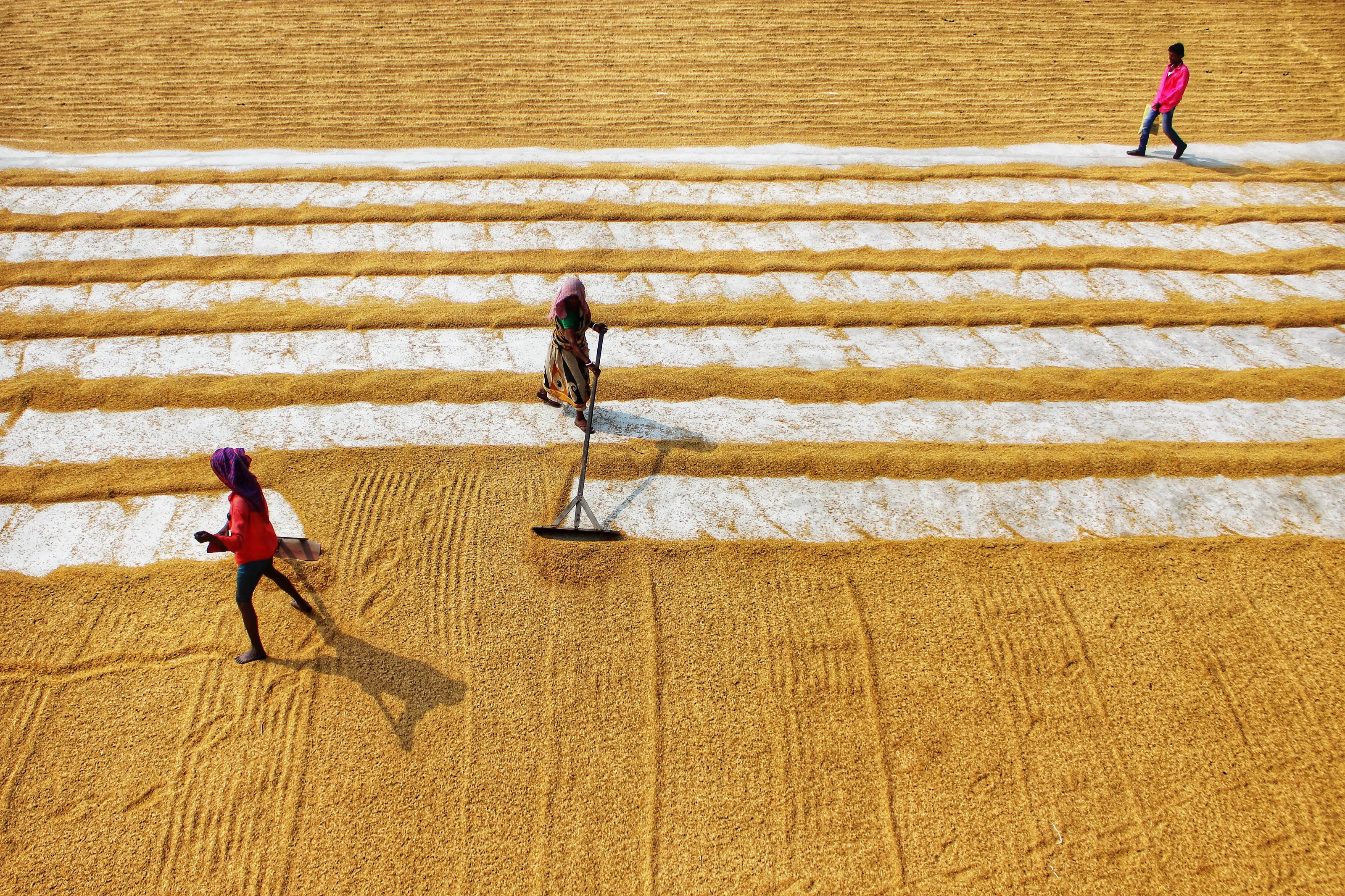
As soon as I saw this image I knew it was going in my top 10, the lines are so straight and the subject matter is so small but stands out so well, for me is what makes the image work, without the person on the image I think it would look flat and uninspiring, but you have done well with your timing as to where to position them within the shot.
Brief
See more contest details
Another great theme for anyone wanting to head out with their camera, eagle-eyed, to explore their local environs and see what interesting images they can harvest. Architectural imagery is likely, and indeed the built, urban environment more generally is going to yield a lot of parallel lines. But look everywhere, and on different scales. Many smaller man-made objects incorporate parallel lines in their construction and decoration, and there will be parallel lines on display in nature too.
5,113 Images entered
Meet the expert judge
2,658 Photographers

I knew as soon as I saw this image that it was going in the top 10 and would be staying there, it's just lovely peaceful and well executed. It reminds me of some of the works from the book I loved looking at while at University by Michael Kenna called Forms of Japan. I love Long exposures and shoot them a lot, so it was nice to see something that stood out well that made the top 10


Another really well-taken image with the person in the shot gives a great sense of scale, the shape of the lines flowing along the building roof work so well with the person running, it almost feels as though they are both flowing together. The balance of the exposure is perfect, the highs in the whites are not too much on the brightest edge and the shadows in the darks still have a tiny bit of detail. Really well shot and congrats on making it to the top 10.


A really interesting perspective of the bridge that as you say, not many will see or get the chance to photograph. You have positioned yourself very well and it also seems that your patience paid off as you managed to get the shot perfect. As you have also mentioned, the 1st thing that pulled my eye into this image was the light catching off the light on the wires. I really like the conversion to black and white as well, as I believe this will have made them stand out a lot more from the sky behind.


This was yet another shot that I saw and I just stopped right away to just enjoy it. It is seeing images like this that have really made me enjoy judging the competition. There is just so much amazing detail in this image and I can see you have spent a bit of time making sure it looked correct. The colour and detail are just sublime in this and it goes to show, the best camera is the one you have in your hand, and on this occasion, the power of the mobile phone has done so well. Amazing work indeed.


I really liked the concept of this image, the colours work well and the person looks good for the sense of scale too, but unfortunately, when you are playing with lines in the capacity that you are, I feel they need to be straight, but I appreciate how hard that can be to do, I have managed to mess that up a few times myself. Also from looking at the Exif data don't be shy of upping the iso and closing the aperture a bit as things will start to be a bit sharper.


I really liked the concept of this image and love how you have managed to get the framing and line up of the metal work going from corner to corner in the exact same place. The only reason why it just missed out on the top 10 was that the white background I found to be too bright, you can just make out bits of details being preserved in there, but for the majority, they look to be lost, I think with being able to see more texture the image would be a complete winner.

This was another shot that I saw and I just stopped right away to just enjoy it. A few questions at 1st, is it a building, is it the right way up, what even is it? All really good questions to get the mind thinking and one of the things I love about photography. Sometimes just having that in a shot just works and it has in this case. I also love your choice of edit for the image as well, Black and White just works, it is less distracting and allows you to get the viewer to enjoy the parts of the shot that you intended them to.


Again this image was so close to being in my top 10, but I just found the top left sky was a bit too bright in contrast to the rest of the image, it may be a personal taste thing, but I could not stop unseeing that aspect of the shot. Other than that, the details in the steps and building are sublime and you have a really amazing image, so very well done indeed.


