


In a competition based around the theme of 'Symmetry', one would assume that mirrors would be a predictable gimmick, but they were often used very creatively. And here they're deployed to great abstract effect. Who knows exactly how the front segment reflects so sharply the grass below? Or from what angle the photographer shot? These questions are a few of the 'sticky' elements that keep us looking at pictures like this. They help forgive the slight issues of centered subject and tonality - issues that kept the image just out off the top three.

Without exception, everyone loves pictures of women in white dresses walking through fields of lavender in Provence, and this image does not challenge to that law. The careful framing ensures that the eye goes right to where it should be going, and the timing of the daylight boosts the effect, dropping the shadows back and brightening the glow of the subject. The only thing keeping this from the Top 10 is the competition itself, and perhaps a little jealousy. Why aren't we all there too?


Of the many architectural ceiling photographs submitted, this is definitely my favourite. The mind-bending quality comes from the uniqueness of the space itself, as rock climbing walls do not necessarily follow standard architectural forms. It took me a few moments to understand what exactly I was looking at. Its place in the top three is earned primarily because, like so many of the most memorable photographs, it seems like it was chanced upon while looking for something else. Such a photograph demonstrates the curiosity of the photographer, and it also shows us the oddness of so much of the world, if only we are open to seeing.


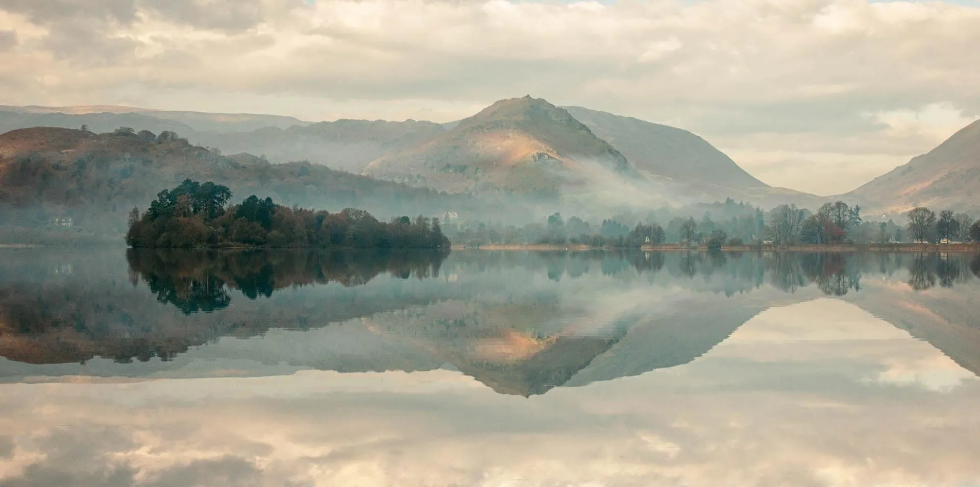
This incredible shot by Alan Ranger captures the beauty of an autumn day in the Lake District, and the perfect exposure brings you right into the image. Of course, it's also a great use of the theme of this competition, but without drawing explicit attention to the symmetrical reflection of the landscape, in which the mirror of the water creates a unique form. Alan's use of graduated neutral density filters allows the sky and its reflection to achieve the same exposure, furthering the equal split at the horizon. This is a unique approach to a classic subject, and an easy winner of this competition!


Portraits were few and far between in this competition, and so this striking image of a bodybuilder in Bangladesh was especially welcome. Natural bio-symmetry is accented by dramatic lighting, and the slight shift in balance between the bodybuilder's weights brings us back to reality. In order to establish a rule it is on occasion important to break it: these various asymmetries help to reinforce the solidity of his pose. Importantly, this image of symmetry came out of the photographer's personal project, and I always appreciate an image that corresponds to a theme somewhat accidentally! Themes such as 'Symmetry' are not necessarily aims in themselves, but should be used as photographic ice-breakers: ways of shaking off the cobwebs while you explore the world through the lens.


This incredible image of the Deal Pier in Kent obviously pleased the crowd, and I love it too. The use of a long exposure smoothed out the water, creating an incredibly meditative mood that works in perfect synchronicity with the warmth of the blended sky. There's no doubting the expertise of this photographer, so the question is, why didn't I rate the image higher? The truth is that it was lost in the mix of so many other similar images. When everyone's attempting the same approaches to the same subjects, it's often difficult for the most successful photograph to attract notice.
Meet the expert judge
544 Images entered

317 Photographers


I feel it's an unwritten rule that every photo competition needs at least one photograph of Paris, but I didn't expect this rather revealing shot of the Eiffel Tower! Pointing upward at ceiling architecture is a well-loved photographic trope, and here we get quite a bit of information about a famous landmark. The netting on the right and the dappled sunlight on the left give some necessary texture, despite the hard-to-avoid difficulties of exposure that obscure much of the detail up on the second tier.
Brief
See more contest details
Upload your best symmetrical photos, whether taken last year or last week. Live crowd voting, expert judging by Alex John Beck, and great photobook prizes for the winners.

This wasn't necessarily a popular image with the crowd, but, of course, it's all subjective, and I see an untold little story in this image. The couple at the end of the barren corridor of trees, staring at the camera, are evocative in their distance. I can't see their exact expressions, nor their identities, and so I plug into their vagueness some specific memory of my own. To me, the trees are the trees of North-Western Europe, and the couple are my grandparents.

Everybody likes a geometric shot, and this one gives you lines upon lines upon lines. The solitary magazine forgotten in the basket brings us back to reality, where things aren't ever so perfect. This splash of colour breaks the monochrome, and then we start to see the little spots of rust here and there, and the hard sunlight. These kinds of movements through an image are always exciting. The effect is boosted by the perfect use of a long lens to compress space and accent the lines. This is almost a scientific study.

Of all the images submitted to this competition this one stuck out for various reasons. Above all, it represents to me many of the most important qualities of good photography, namely visual curiosity, emotion, and flexibility. Though the subject is not necessarily the most perfect subject for the theme of symmetry (many other entries focused primarily on architecture or reflections), the photographer and subject didn't seem to care so much and created a photograph that made peace with the theme, while having fun with it too. There are countless examples throughout photography history of successful images that are not perfectly composed or focused, but which perfectly capture the feeling of a moment. Cartier-Bresson's images, so impulsive and magical, are often less sharp than contemporary photographers would ever allow, but nobody ever thinks to fault him. Here a small action on a quiet street is turned into something more real, through photography and lenses and light and reflection. The apparent issues of cropping, flat light, and use of a small, non-professional camera are excused.

For my third place entry I picked this haunting image of a small altar, submitted without too much information. I am an obsessive about decent composition within a 2x3 frame, and the tension between the gorgeous black and white tones, the edge of the altar and the bars of the window solidify an enigmatic image. The silhouettes of the candles and the icon are form-first. The meaning of the objects is secondary to how they sit within the frame, and the instructive lesson here is that if an image is well-composed and well-toned, on occasion the subject is irrelevant. Perhaps it is enough for things to be merely placed correctly. The depth of field and granularity of the grays give the image a timeless, unknowable quality. Here the subtle curve of the wall around the window, and the oddness of the shadow below it, give us enough to muse upon.
75,114 Ratings


This picture is an experiment in portraiture, using a classic trope to great effect. It is striking not only because of the subject matter and composition, but also because of its delicate coloration and obvious and focused intent. This overlapping portrait technique has been used over the years in various ways, but of course it reminds me mostly of Bergman's 'Persona', wherein this composition is used to convey the theme of the shifting, exchanging personalities. It poses a few questions: what is the relationship between these two? What are they thinking?


There's a lot to like in this photograph of two underground train station platforms: the sharp lines of the hanging lights, the pleasantly converging parallel tracks, and, most of all, the almost-vintage toning of the orange and the blue. The color and density make the station seem both antique and futuristic at the same time - a difficult combination to be sure. The minor detracting element comes from the prominence of the ceiling, and the tipping-forward of the uprights - a function of the use of a super-wide lens. A tilt-shift lens would have been useful here, to ensure a wide and satisfying frame, and, with a drop of the front element, minimising the convergence of the architecture.


This image is not immediately recognisable as an example of symmetry, but you see the reflection in the rain eventually, and then the picture starts to give up its pleasures. The delicate colour treatment, all pastels and grey, brings out all the rain. The lack of a true black, in other images a disadvantage, here makes the day look even drearier, and strengthens the tonal choices. The use of a super-wide lens allows us to look around a bit, and doesn't tell us exactly where we should place our attention. This is an odd and an interesting kind of documentary image.


