
I really quite like this. An homage to the artist Mondrian on the Brighton seafront... big, bold colours well seen and captured. It is one of those images that makes you look again and try to work out exactly what it is, but in a good way – a sort of visual maze. This is an abstract composition that relies on straight lines but also has subtle curves and rounds dotted about to break up the colour blocks and the back metal shutters.

A bold and graphic composition that uses the flat wall, angular light and shadows to isolate the figure. This image is all about contrast: the figure of the man with diagonals bisected by the square of the background; the figure and his elongated shadow. I like it. I think that it's well thought out and I suspect that the photographer saw the potential before the image came together in the frame that we see. Certainly a different take on a commuter's journey.


I really like the oddness of this image. A whole host of geometric shapes and patterns really force you to look again and again. The red umbrellas dominate but your eye moves around the bold pavement designs and the randomness of the car colours add an extra dimension. The couple walking - top left - are very well observed as is the fortuitous white car on the opposite side of the road. This is a well seen image. In contrast to so many images of straight lines of buildings, the photographer really had to work to compose around the main shapes.


I like this on many levels. I like the intense, vibrant colour of the wall and Iike the shapes of so many of the compositional elements. It strikes me as almost a humorous image: the tiny figures battling to paint a huge space and clearly wobbling doing so. I especially like the splashes of blue that are the paint pots but in terms of straight lines there are very strong graphical elements. The windows are frames within frames and the workers are balanced over in one third of the frame: a classic compositional trick.


I can't really fault this and it's a really pleasing frame. Lots of individual pastel colours make for an abstract mosaic on a hillside. It's a pleasure to let the eye meander around the frame picking out tiny details and subtle colour. The use of a long lens to flatten the image is well chosen but I wonder whether the photographer might have gone the whole hog and gone in even tighter: I find my eye annoyingly going to the top left and looking at a space where a colourful house might be. But for all that, a strong and bold statement.

This is almost there – a really brave attempt which almost works. I love the curved diagonal lines that separate the ground floor from the mezzanine and I love how the walking figure is captured breaking the lines in such a pleasing way. The kids looking up is bad luck and makes what could be an almost completely abstract frame that just hints at personality behind the human figures something sadly less than perfect. The highlight are almost near their peak too, sadly, but a cracking effort.


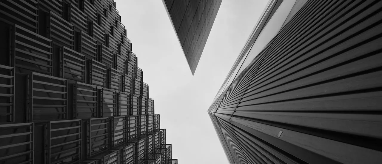
A very strong image that is graphic and subtle at the same time. The grid is hypnotic, the footsteps intriguing. It made me think of the film The Third Man when I first saw it - the echo of footsteps. It shows a lot but doesn't tell much. I like the unique angle and I like the way the legs disappear into a soft nothingness. This is an image the photographer has waited for and anticipated and here patience has paid off. The colour is muted and low-key adding to the ethereal quality of the frame. A simple, lovely moment. Well done.
1,442 Images entered
834 Photographers
167,089 Ratings


This is eautiful, gentle and strangely calming – a rather serene image that grows on you. I like the subtle palette of this hi-key photograph – the gradual curve of the lines contrasted with the harsh concrete and light. A well-observed landscape whose 'action' in the frame is neatly mirrored by the shadows bringing our eyes to the symmetry of the stairs with a strangely sensual curved shadow behind them. I think it's rather clever and a bold use of the frame's shape.


Sometimes simplicity wins. I really like this. The subtle, muted colours work really well - a kind of pastel range of tones here. The image is well seen and the image well executed. I like the fact that there are very few reflections of the railings in the puddles and for me, that means a layer of creativity which shows imagination and thought. This is a mood picture - not an obvious attempt to interpret the theme - and all the stronger for that.


Meet the expert judge

Brief
See more contest details
Straight lines occur in nature and in the built environment, on scales large and small. You’ll see them everywhere – thick, thin, hard, soft, overt, implied. For this contest sponsored by <a href="http://www.alamy.com/" target="_blank">Alamy</a> we want to see how you’ve captured and used straight lines in your photography, from the abstract to the observational.


What I like about this is two-fold. Firstly, it's really nice to see a photographer vary his angle, in this case getting above and looking down. Secondly the image is about contrasts; the contrasts between the diagonal pattern of the wooden floor – so regular and solid – and the very human, irregular lounging figures. I think the image has humour and the composition, one that gives both elements space to breathe within the frame, is rather lovely. The black and white processing means we focus on the shape rather than the (potentially) distracting colours of the figures.


I think that compositionally this is very strong and rather brave. The photographer has taken a chance and, with a bit of luck, has a frame that is seemingly random but pleasantly easy on the eye. Big diagonals criss-cross the frame and the walkers seem to be almost circling each other as they go in different directions. The black and white processing emphasises the gritty abstract nature of the shot and their shadows seem to point out of the image following the diagonals. The pram/shadow makes an interesting contrast to the two single figures.


I really wanted to like this. It's such a classic reportage image that gives both written and visual information and for some reason a rather gentle humour, but it has such a heavy tone that I can't see anything! Either one uses deep blacks as a silhouette, in which case you really have to simplify the shapes (so maybe just the man and the railings – a lovely shape) or you open the tones out to show the details as a properly exposed frame. This is the worst of both worlds which is a shame because there's a nice picture lurking in here somewhere.

Sometimes images don't have to be excessively complicated to be impactual and this one is a good example of exactly that. The lines of the bunting radiate outwards from the corner like sun beams in a very pleasing pattern of seemingly random colours in line. I like the deep blue and I like the saturation of the flags: this isn't a difficult shot but its unfussy execution is pleasing to the eye and that's why it works. On brief and simple.


I think this is an intriguing image for its structure and its colour, but, although I like chaos in a frame this is almost too much. Could we have made a better frame by shooting more square-on and in doing so losing the horizontal that isn't quite plum? Maybe. Perhaps also framing so that the street level signs weren't so visible. By isolating the doorways it might have been a stronger image. I like it and it's a good effort but not quite there.

I really like this. So straightforward: a moment in time reduced to a simple form. One of those everyday instances that we take for granted but that which a photograph, carefully planned and executed takes to a different level. On one hand here is a very obvious instance of a plane and its vapour trail, but on another it is a little poem about line and structure. A simple diagonal bisecting a clear blue sky. I find myself wanting the trail to exactly match the two corners and the fact that one knows it will not, makes it almost hypnotic.


A real eye-catcher – a splash of red in a grey sea of lines. I like this because it works on two levels: one of abstraction and the other of colour. That said, I find the woman's arm and handbag a little distracting, as well as the shadows in the top right. It could be more abstract –we know it's a woman walking but would the absence of her arm and bag mean a stronger frame? I think so. This is a posed image so if the instruction would have been to lower the umbrella to obscure more of the body it might have worked better. That said, still engaging.


Almost. When we're dealing with angular, abstract composition however, we have to be really precise. The framing is good but I find myself distracted at the top of the stairs: I want to see the end of the handrail. It's frustrating to have that element lost because the photographer has really made an effort with the shadows in the forground. However great composition is about making sure everything in the frame is visually appealing, and this just falls on that.