
This is a beautiful shot, however in my opinion there is too much editing which detracts from the beauty of the setting. You would have been better served merging the two aspects of the image (the ground and the trees) more subtly so that were was less of a distinction; this way, the photo would have appeared more natural. That being said, the colours are vivd and sharp and this enriches the image of the landscape, particularly the bottom of photograph,

Wow! What a brilliant black & white portrait. I think you made the right choice by removing all colour from the shot as it would have distracted from the subject, which is so strong. It was also a great move cropping the photo to centre the eyes as the viewer is drawn towards them and is left asking questions; who is the man? Why is his face painted? What is he seeing? The best aspect of this shot however, is the subtlety in which you've addressed the brief. There are stripes in the shot, the paint, the wrinkles, the hair, however you've used them to compliment the image as opposed to them BEING the image.


923 Images entered

733 Photographers

It's needless to say that this was not the only image of a zebra that I've come across, however yours is striking in its simplicity. While the stripes make up the majority of what can be seen, they don't dominate or detract from the face, or more specifically the eye, which grabs and holds the attention of the viewer. Using only black and white was a great choice and helps to accentuate and enrich the shapes/lines, and it's also great to see very discreet editing.


First of all, congratulations on your photo taking first prize! Over 600 images were submitted, and yours stood out amongst the rest. I believe that 'Stripes' was quite a difficult subject given that they're something we see everyday and everywhere, and it takes a lot of skill to make something so commonplace seem beautiful and interesting. Not only have you achieved this, you've managed to do it so skilfully by combining so many different textures, shapes and colours in the shot. What really caught my eye however, was the upside-down position of the camera beneath the stairs; this, coupled with the framing effect of the staircase, drives the eye toward the centre of the image.


Congratulations on submitting such a brilliant photograph. The colours are what first grabbed my attention because of the feelings of calm and tranquility which I naturally associate to these shades of blue, and coupling this with the simplicity and minimalism of the image has produced a stunning picture. It's clean, both in terms of subject and editing, and so there's nothing to distract your attention and you've framed the subject perfectly by positioning the telephone in the centre. Very well done!
72,535 Ratings


What I like most about this shot is the tenderness that comes across, despite us only being able to see a very small part of the subjects; it allows us an insight into an intimate human relationship and leaves us questioning who they are, where they are and what they're doing? Classic portraits are often shot in black and white as colours can distract from the emotion that is being portrayed, and so it was a great choice on your part to remove the colour to achieve this effect.


Brief
See more contest details
If you look, stripes can be found everywhere: in nature, in architecture, on the street, in your own home. From shafts of light falling in a pattern to rows of crops, street markings, or something completely unexpected, show us your most creative shots of stripes for a chance to win prizes and recognition...
Meet the expert judge


Whilst this is an interesting shot to look at at first glance, when I look at it in more detail there are some aspects which could have been changed to improve the overall aesthetic. Firstly, the girl in the picture looks quite out of place and she's interrupting the pattern/harmony of the stripes. It looks as though she's been placed there during post-production, which isn't always a bad thing to do, but in this instance less would have been more. The top left-hand corner of the shot is also quite distracting, mainly because of its size, but it's also a different colour to the darker bottom right-hand corner. Had they been the same colour, there would have a sense of continuity running through the image.


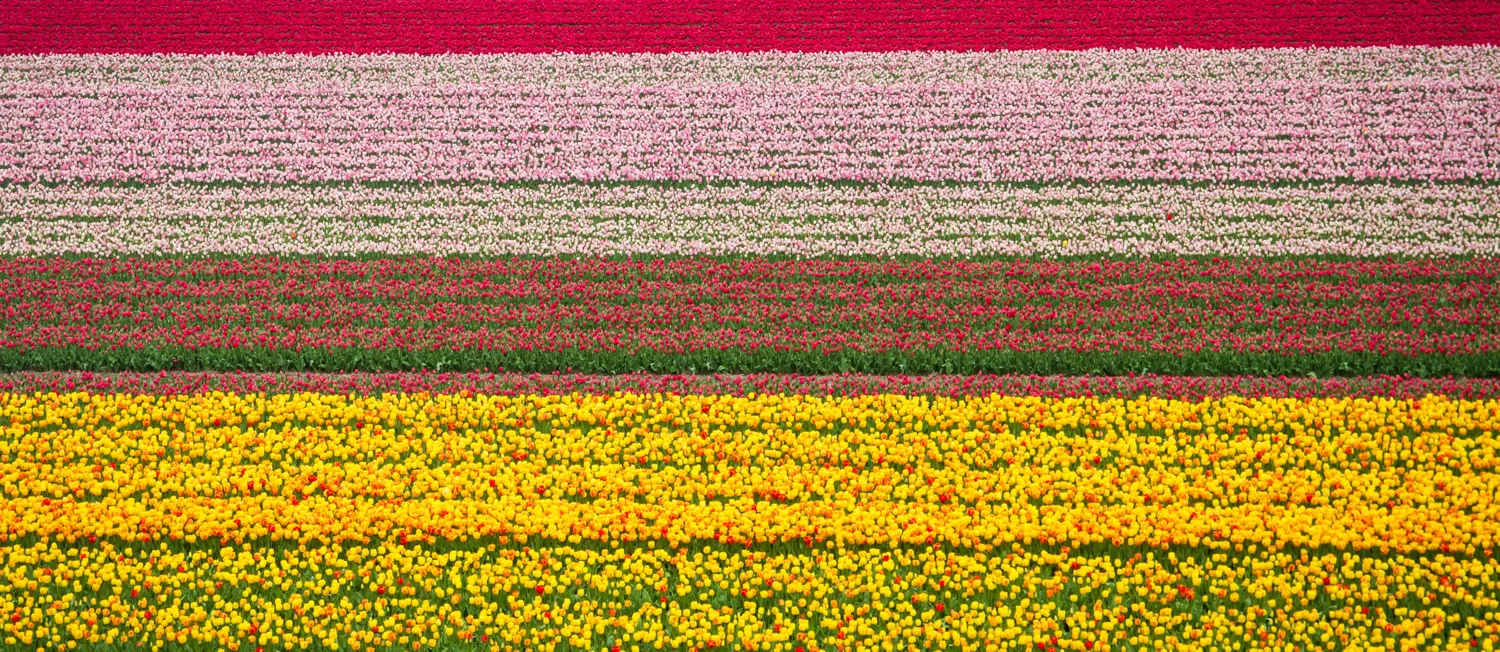
You've captured a very beautiful agricultural landscape here, and the colours are brilliant and vivid. Using black and white, which would normally be more suited to the theme of stripes, would definitely have dampened the overall shot. I really like the depth of the photo and the angle from which you've taken it (from inside the hot-air balloon, I assume) however there is little in the image to really look at. Further to this, the stripes play quite an insignificant role in the shot.

At first, I couldn't make out what the image was. However, after reading the information you submitted, I can't help but marvel at how well you've captured the atrium of the hotel and how different you've made it look. The curves give a sense of endlessness, almost as though we're looking through a tunnel, and this effect is heightened by the simplicity of the colour scheme. In actual fact, this shot is brilliant mostly because it doesn't really look much like a photograph, more an abstract piece of art. Congratulations!


The expression on the subject's face is so intriguing, it makes me wander what his story is. Couple this with your use of light and shade, and you've created an engaging and mysterious portrait. The technical aspects of the shot are interesting to examine too, such as the lower saturation and limited colour palette, which make it look almost as though it was shot in black and white, and the position of the subject to the left of the image. This allows the viewer to explore the background, which is just as encapsulating as the main subject.


First of all, congratulations on such a powerful architectural image. I really enjoy seeing that you've taken the shot from below, and you've managed to create a sense of endlessness, emphasised by the size of the buildings and the darkness of the sky above. The black sky contrasts perfectly with the vibrant colours of the modern buildings, and the sharpness and detail of the lines help to elongate the image. I had expected a lot of black and white photographs to be submitted given the nature of the brief, but it was a great choice to use colour in this instance.


This photograph is strong because of the symmetry in the lines and the effect this has on the roof; it almost looks as though it is spreading out from the centre of the shot. Using black and white was a great choice because there is less to distract from this, and you've amplified the effect by keeping the photo very minimal with very few subjects. That being said, the effect of the roof isn't strong enough to carry the photo and there is little else to hold the attention of the viewer.


