Get notified of their new contests

What better calendar for a photography calendar competition than a calendar specifically aimed at photographers? Your nostalgic still life will pull at the nostalgic heart strings of all romantic photographers harping back to a time when cameras were beautiful, intricate pieces of visual equipment. The carefully displayed antique cameras alongside assorted glass filters reflecting the immaculately lit surroundings is a neat piece of fine art just bellowing to be displayed on photographer’s walls.


Your calendar would brighten up any room with its splash of spiralling multicolours making it a highly visible abstract. I can visualise a series of kaleidoscopic swirls running throughout the months set against black backgrounds with white dates reversed out at the base of each page. The slightly fussy typography wouldn’t have been my first choice but it works here especially with the subtle drop-shadow lifting it from the busy background. You’ve expertly managed to distort your iPhone photo to creatively compose a captivating psychedelic cover.


The unexpected twist in your quirky calendar cover is that a photo doesn’t have to be shot on a beach to qualify as a seaside photo. Reminiscent of Martin Parr’s book ‘The Last Resort’ your themed photo is comparable to his offbeat New Brighton observations. You’ve shown that children don’t need sand and sea to enjoy themselves - using a puddle as a makeshift beach can obviously be just as much fun. Selecting an otherwise bland section of the concrete car park and turning it a sandy colour for your heading was the golden touch that helped make your entry my winner.

There’s a surreal atmosphere that’s befitting a car park photo bereft of any parked cars. Alternatively we see a blue and white, uniformed, army of lamp posts standing to attention on the cross-hatched parking bays. The puddles add a grounded dimension to your unique subject matter and I like the reflected irony in one of them looking like a national speed limit sign. I imagine the target market for your quirky-themed calendar would be car park attendants and frustrated wheel-clampers on the hunt for vehicles that have outstayed their parking time.

I never get tired of this iconic view of Buttermere in the Lake District. Shot during the blue hour your panoramic view lends itself perfectly to a horizontally elongated, calendar. The sweeping snow-covered hills serve as a soft winter backdrop to the stark black tree silhouettes reflected in the still waters of the lake. The size of the serif typeface at the top is nicely balanced without disturbing the peaceful equilibrium of your landscape setting. The theme of your calendar could have benefitted from being slightly larger and centred at the base of the cover in line with the title above but that doesn’t diminish the impactful beauty of your calendar cover composition.


You have taken this opportunity to shamelessly use your own name as the theme for your 2022 calendar. I usually avoid judging entries when photographers identify themselves (because it’s against the spirit of fairness towards fellow competitors) but, in this case, its a genuine calendar category and I’ve allowed your cheeky self-publicity. Your still life of a half-peeled banana nonchalantly posing for a full-length, studio portrait is very skilfully executed. I’d be intrigued to know how you see your calendar pages developing - whether you’d stick to banana full-frontals or if you’d vary your subjects by using other fruity poses.


This is a great graphic design for a calendar front cover. Good clear typography on an uncluttered background with the text perfectly aligned within the horizontal brickwork. The hint-of-a-shed photograph teases the viewer to open the calendar and see what kind of images are on the inside pages. The positioning of the pink shed roof pointing directly at the title is a clever visual ploy. Photographic minimalism has played a great part in building this successful square-cropped entry and I commend you for shedding a light on an unlikely calendar subject.


I’d virtually chosen my top ten contenders when along came this Patagonian landscape looking like a surreal painter’s dream scenario with ethereal hills lit by the off-camera sun. The positioning of the tiny horses and lone tree command attention by being placed exactly along the rule of third lines. Your jazzy, roaring-twenties typography is completely out of context yet somehow it fits - probably because anything goes within a dreamlike fantasy.
Meet the judge


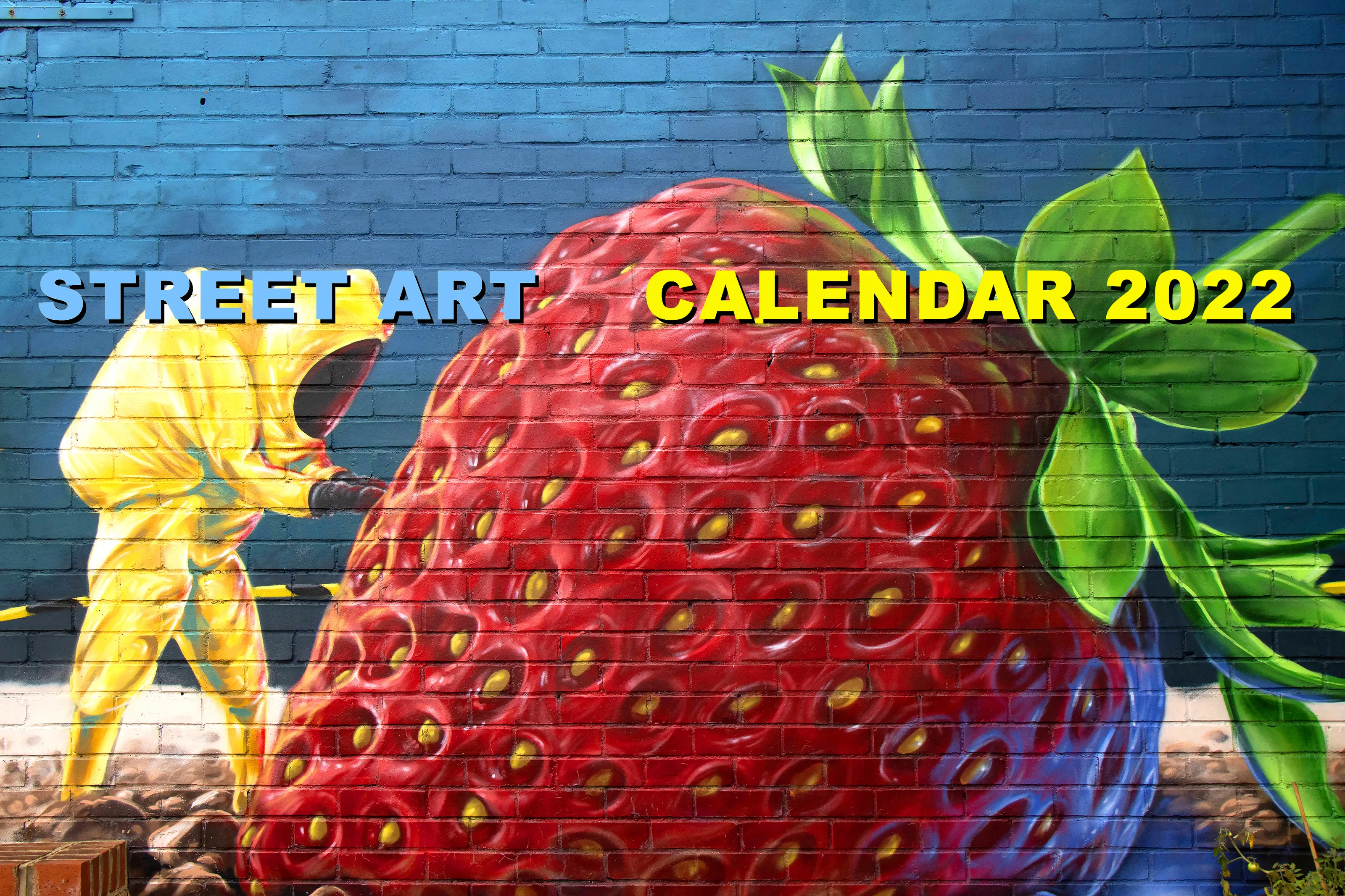
The painted realism of this calendar cover looks realistically convincingly which is exactly what the trompe l’oeil theme is designed to do. Your illusionary photo left me in two minds trying to work out if the photo was a two or three-dimensional composition. There were a few street art calendars entered to this challenge but, in my opinion, your subtilely captured vision piped them all. Vertical lines of lettering stacked on top of each other are difficult to read but here it just adds to the trompe l’oeil effect and further tricks the already confused mind.
Brief
See more contest details
In this photographic contest I would like to see one of your photos as the front cover design for a 2022 calendar. The cover design must also feature text with the title ‘Calendar 2022’ and have the name of the theme of your entry. In my judging I would prefer to see no other wording within your submission and please use just one photo. The theme can be anything you like from the typical annual offerings to something completely different. I cannot wait to start flicking through your themed calendar designs.
705 Images entered
410 Photographers
39,980 Ratings


