


Lovely. A really striking image of an interior packed full of detail and colour. What I like is the framing that inevitably leads us down the hallway to the door arch at the end. Clearly a little bit of post-production in getting the angles straight (unless you were using a tilt and shift) but curious about the aperture used so wide open that all of the detail is rendered so clearly... but niggles aside, this is striking.


Such an intriguing and interesting image. I love the way that you've shot upwards to reveal the beauty of the inlay of the stairs and also by doing so engaged the viewer to almost climb the stairs with your gaze. However, what distracts is the figure at the top: colour-wise it jars and his surroundings in terms of the highlights are blown. Better overall exposure would help but a simpler solution would be the frame it so that the figure is excluded. Still, this is a nice image - keep pushing.

Love this - the patterns and the symmetries. However, if we have enough time to make a shot like this a little more thought in terms of framing and position would be beneficial. If we're making an image about symmetry and pattern we have to be exact in our framing and I can see that the edges of the image fade out without the resolution of the bookcase. Also, the image is very slightly off kilter. Architectural photographers would use a tint and shift lens to control divergent angles although there are settings within many photo editing programmes that could do a decent job. This is a good shot - push on to make extra effort and you'll be rewarded by an excellent image.

I really like this - it gives an enormous sense of peace and tranquility and sanctuary. I like the light shape on the chair and I like the book placement - it all feels very natural. But. I want to see more of the room - not because I'm nosey but because the light spread is very small and there's a lot of detail in shadows that I feel I'm missing. Counter-intuitively, the way to do this is to add additional light and control it in exposure - one or two external strobes would do - likely bouncing off a wall or ceiling. That would turn a good image into a cracker.

Good photography is usually about where you stand and when you press the shutter. This image reflects both in a cool, considered way. I love the space that the photographer has given to the architectural symmetries and the colour palette that is entirely harmonious. The figure, captured in gentle motion - is poised absolutely clearly suggesting a small, unobtrusive human presence amongst the tomes. Excellent and very visually pleasing.


This is good but there seems to be two images here and what we have is a bit of a compromise. Let me explain. Either we have a very functional image of the library - decently composed and exposed (watch your highlights) OR we have an image that is about a woman looking at books. The problem with that is that she's on the edge of the frame and barely sharp. Additionally she cut-off mid-look so to speak. I'd have liked a bit more of her to be visually clear about what we're looking at. That said, not a bad job. Well done.


This is an engaging image that tries to tell us about what looks to be an historical study. It's well seen but a little awkwardly framed with I suspect little space or time to make a better image. The biggest issue however is the exposure. It seems that the camera has decided to meter an average of the whole scene and blown the highlights completely from the window and the papers on the desk whilst leaving the shadows blocked and heavy. Two ways around this - more careful metering (don't rely on the camera) or introduce your own lighting that you can control. Still, a good effort.


Delightful. A real sense of learning here but more - a sense of the antiquity of place. I like how the arch frames the young monk and the concentration captured on his face. The closeness of the photographer - both physical and emotional - emphasises the diligent study. Nicely exposed and composed. Well done.

Meet the expert judge
1,715 Images entered


This is a lovely frame - well balanced, composed and quiet. The wall on the left leads us to the reader and the portrait above her seems to look down sympathetically. All good. But the colour! It might just be me (it often is...) but if a frame is strong - and yours is - why alter it after the fact with post production that distracts from the human-ness of it? A good picture doesn't need bells and whistles. Love to see this processed as shot - sure it'd be lovely.

It's the simplicity and the abstract quality of this that I love. I like the pattern of the books and then the interruption of the door into the frame with its door plate, escutcheon and door knob. The rectangles and the circles work really nicely suggesting rather than telling. My only slight thought is that the light on the door is rather harsh and although it does make the door 'pop' it slightly unbalances the image - but this is a minor niggle and you've produced something lovely.


Delightful and well done for choosing such a unique and interesting angle from which to make an image. I really like that bold choice that incorporates the curve of the carpet and the circles of the little girl with the squares and regularity of the books. For me it has a little too much forced colour (I presume the result of post production) because when an image is as strong as this it needs less not more. But well done with this - a nice antidote to lots of images of book shelves.


860 Photographers
48,435 Ratings

Brief
See more contest details
We have created public libraries, and private studies, as places where we can have the quiet needed to focus on our reading, our studying, and our work. These refuges of calm give our minds the chance to settle and make progress on the tasks at hand. Libraries range from the wood-panelled and mediaeval to modernist, well-lit masterpieces. Studies may well be enjoying a renaissance, with the shift towards homeworking, and will be more of a reflection of the owner. We’re looking forward to seeing how you’ve documented these spaces, and hope that you didn’t make too much noise when you were shooting. Shhhhhh!


Now, let me first say that I love the simplicity of this. It's pretty decently exposed and takes advantage of the symmetry and abstract nature of the architect's vision. What niggles me however is the ground floor: the woman (?) in a hat reading an illuminated panel and the corresponding pillar on the opposite side. Sometimes when we make images like this we have to choose if anything is going to distract that we might exclude and I think that this would be a real cracker if framed a tiny bit tighter. In any case, a really nice job. Well done.


I really like this and it stands out from the numerous images of either books or architectural shots. Libraries are about people grazing and finding books. This image - posed or not - gives a sense of that search and the concentration required. I like the shape and I like how the photographer has framed the face. To improve? I think that the text 'New Books' that is slightly obscured frame top right is distracting but overall this is an innovative and well seen image.


Beautifully seen and composed in frame. This is an innovative shelving well imaged. What I like is the symmetry - although I suppose if I'm being really picky I'd have liked to have seen *all" of the shelves complete - but what makes it for me is the pile of books that are leaning bottom right. They give the image a human touch and that reflects the role of the library. Nicely seen.


I really, really like this. The sinewy curve of the chair in particular is a delightful and mirrors the curve of the book pages. It does indeed as the text suggest give a feeling of stillness. That said, even when we are making such high contrast images, I always like to see something of the mid-tones and whilst this is a matter or preference, I do wonder if there's another subtle dimension that could be brought out with just a little more in the exposure. However, this is a cracking image. Well done.


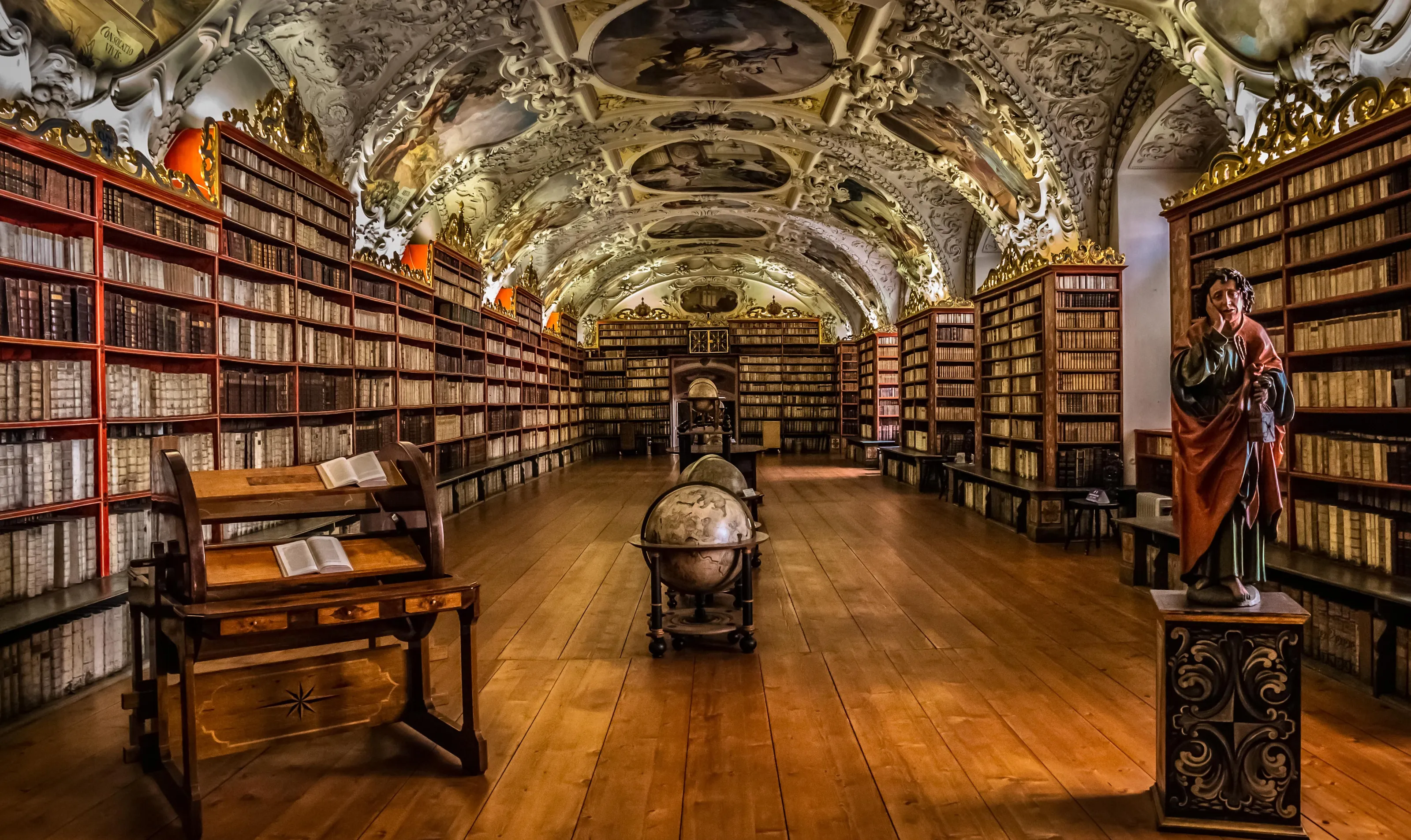
Really nicely done. I like how the photographer's carefully metered and composed and used a very wide lens (presumably with correction) to engage the whole room. I like how the stucco work is neatly framed - especially the major painting detail front centre. My only minor critique is that the leg of the reading stand bottom left is cut by the frame - and it's the tiny details that slightly marr - but this is a strong frame.

Although I can see that there's a lot of post in this frame - specifically the stitching of frames together - you've produced a really intriguing and special image. I think it's rather lovely even if it isn't entirely 'real' (whatever that means in photography these days with technological challenges questioning the nature of the medium). What you've done is likely what the architect envisioned when designing the space and so I'd like to think as well as a cracking image this is a kind of homage to an idea. Well done.


Love it - a real character portrait. The frame itself is straightforward and all the better for it but two things - the shop owner looks a bit too posed and is staring off camera. No idea how you set this up but sometimes it's good to talk and direct less if someone's a little camera shy - or to avoid staring tell the subject (who seems very stiff) to relax and slowly close and open his eyes. You get a more natural look. And speaking of that - I'm curious about the post production colour here - if a frame's strong enough it doesn't need additions of rather garish colour after the event. Still - a very nice effort.


