The repeated pattern of this multi-storey tower does indeed become pattern-like. This photograph (though not absolutely perfectly framed) reminded me of the incredible series by Michael Wolf in Hong Kong.
I particularly appreciate that the strong vertical lines and tones being offset by the angled reflection bottom left of frame. This addition helps to add nuance to the overall minimalist rendition.


A strong classic composition provides a meaningful band of information at ground level (the figures and street architecture provide dots of interest. The bulk of the frame provides space for the glass tower to soar skywards. The reflected clouds merge with the clouds behind to provide a 'cotton wool' contrast to the hard-edged built environment.


This photograph piqued my curiosity. At first glance it appears to be a solid, slightly angled column. However, the photograph has in fact been rotated 90 degrees clockwise.
Further research (using Google street view of Sky Tower, Auckland) provided the necessary information to support my observation.
Regardless, this composition works brilliantly as a striking and graphic composition of mass, shape and contrasting light. Excellent.


Super tight composition using what looks like a long lens, has compacted the vertical strands of the building's curves. It now has a pattern-like quality. The perspective control is perfect (no doubt reflecting the architecture itself). Our eye darts around the frame exploring the details, leaving us to wonder what is beyond.


Successful photographs of architecture almost always require thoughtful, balanced compositions. This photograph exhibits solidity of structures but provide plenty of detail and nuance.
The colour works particularly well – though the buildings have a neutral hue, the warm of the artificial lighting is accentuated by the cool blue of the post-sunset sky.


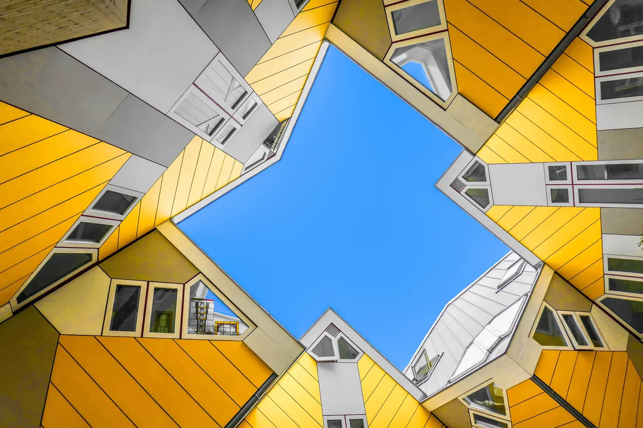
What attracted me to this photograph was the odd overhead view. It reminded me of Alexander Rodchenko's innovative photographs from the 1920s, which broke the status quo of how architecture could be rendered photographically.
The bright yellow paintwork looks almost as a post-production addition to a monochrome image (this point also made me look harder at it).
The bold shapes are offset by smaller details of the building's features – all of which are perfectly balanced within the frame.


I saw several photographs of this building from this angle in this contest. This classic rule-of-thirds composition provides ample information to explore the building, follow its leading lines to the right-hand third of the frame where we see distant buildings to create a striking contrast of scale.
The warm, late afternoon light compliments the blue of the sky. And, that little puff of cloud adds a quirky note to finish our view.


The V&A museum was a popular subject in this contest. What I thought worked well in this instance was the tighter crop and more central position of the 'underpass' from one space to the other. The figures provide a sense of dramatic scale and function of the space. The leading lines reinforce that central gaze. The monochome rendition reduces the building to a composition of shape, line and gritty texture.


Building elevations such as this cry out for a one-point perspective view. Our photographer has done a pretty good job in corralling the lines and shapes, in that regard. The fire escape, centrally placed, provides visual relief from the rigidity of the vertical and horizontal lines. The hanging clothes further this notion, adding an important reminder of the humanity within.
4,977 Images entered
Meet the expert judge

An excellent composition anchors the buildings within the frame. Notice how the brightly lit orange elevation faces out of the frame to our left. This is neatly balanced by the other brightly lit building section to our right. Our eye is attacted to these – we bounce between each – and then settle on teh nuanced patina of the central elevation.
Collectively, these elements provide both striking contrast and subtle detail information.
2,252 Photographers
134,205 Ratings


The initial impetus for modern architectural design was born from the recognition that simple, utilitarian design served not only a pragmatic rationality regarding the function of the building, but also that it could be attractive, too. This photograph has a wonderfully simple composition that marries perfectly with the building's design.


Simple but bold architecture requires a simple but bold photograph to represent it. This one works perfectly.
The MAXXI, a relatively new addition to the Rome skyline, nestles amidst older low-rise, predominantly residential buildings. Our photographer has worked this simple fact into a striking photograph of architecture, old and new.


Brief
See more contest details
Modern architecture was largely born out of the modernism movement of the late 19th and 20th century. Traditional building and design materials such as wood, stone and brick gave way to industrial materials such as glass, steel and concrete, and there was a move away from ornate styles to more practical, minimal styles and the idea that form should follow function. There was an embracing of minimalism, and a rejection of ornament. For the purposes of this contest post-modern architecture is also included in the definition, and the contest is for exterior views, not interiors.