Get notified of their new contests


An image full of a wonderful variety of different shapes, sizes, colours and styles of architecture. Well focused and exposed, full of detail to explore with the eye. A great vantage point has enabled you to get a wide view, but remain close enough for the details to be seen. The older church building is probably the main focal point, well positioned on the left third line, but with this type of image I feel it is more about the slight jumble of different shapes and colours etc, so an obvious focal point does not matter too much. Great work, well done on your top ten placing.

Firstly an overall comment on the contest judging. Sadly there were a fair number of entries which were not on brief, and none of these have been awarded however great the image may be. Just because it is night and the sky is dark, or just because there is not really that much sky showing between or above the buildings, that clearly does not equate to "no sky". Similarly I have not awarded images taken indoors or which were more close-up architectural images rather than a wider urban landscape. Thank you to all those who stuck to the brief.
On to the winning image: This is just the type of image I was looking to see, where the urban landscape becomes a rather abstract composition of colours and shapes. One key to the success of this shot is the extreme telephoto lens used, which has greatly compressed the perspective which I find very attractive. I love the capture of the multi-colours which all contrast and compliment in a busy but harmonious scene. A great amount of detail in the different shapes and sizes of walls and windows for the eye to explore. A pleasure to view, congratulations on your winning image.

A great subject choice for this contest, and as with many of the great images in this contest, one which I feel is far stronger through the lack of sky included in the image. Instead, although the subject is very obvious, it has also taken on quite an abstract feel. Your editing has further accentuated the abstract nature of the shot, as the colours have been pretty much reduced to very limited shades of pinky red and grey, which encourages the eye to wander throughout the scene to inspect all the different shapes and angles of the roofs, without being pulled in any one direction by a dominating colour or area of brightness or strong contrast. The image gives a real sense of the place from your wonderful vantage point. Congratulations on your third place finish.


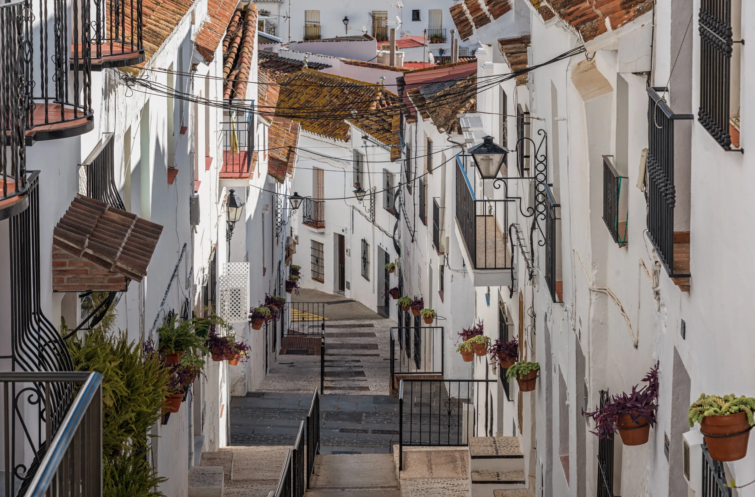
I am not usually a great fan on HDR procesed images or those which are quite pencil sketch-like and watercolour in effect, but I really like what you have captured here, and the processing style really suits the subject. I can understand the decision for HDR, as the sunlight looks to be very strong and casting heavy shadows, which would often result in loss of detail and big dark patches of deep shade dominating the shot. Instead there is a lovely lightness to the image, complimented by colours which are not too harsh or saturated. Composition of the image is good too, as the buildings on each side are nicely balanced, and the eye is drawn into the image and up the sloping alley, leaving the viewer with a feeling of intrigue as to what delights lie around the corner. An image I like more each time I look. Congratulations on your second place finish.

The editing effect added to this image to give a slightly softer, low tonal range and lowered saturation seems to really suit the subject and gives a feeling of uniformity across the shot, which gives a more abstract look which I really like. Framing is just right for me, as we see a decent number of differing buildings, but they are close enough in to be able to study plenty of detail. A well captured urban landscape, well done on your top ten placing.

A lovely capture of the tiled rooftops, a rather higgledy-piggledy cluster of buildings it is difficult to determine where and in what direction the streets would run down below at ground level. Again as I have mentioned in other comments, by eliminating the sky there is clear focus on the shapes, lines and angles of the architecture rather than just viewing a pretty photo of a town. I like the colour contrast between the predominant terracotta with the occasional little pops of rich blue scattered across the frame. Great work, well done on your top ten placing.


From this overhead perspective, we can see some sort of order, as the streets look to be pretty much in straight lines. However, I do like the slight sense of disorder which you have captured, and although each individual dwelling looks of a very similar style to the next, the differing colour rooftops and extensions create a lovely mosaic. There is not one obvious focal point (maybe the street running on the diagonal across the right third of the shot) but I think the lack of a main focal point does not matter with this sort of image, as it is about the whole scene rather than one specific building. Great work, well done on your top ten placing.


This image was a late entry into my top ten, but was one I kept coming back to. I like the composition of the shot, with the shoreline running on a diagonal across the frame, creating two distinct and contrasting areas of the buildings and the sea and sand. I think this image is really benefiting from the exclusion of any sky. The image is sharply focused throughout, and details such as little windows and fences can be clearly seen around the settlement. If I were being picky, I may be tempted to apply some selective editing to the area of land where the sunlight is catching on the top right section of the frame. Here I would try to slightly reduce the exposure and also maybe adjust the white balance slightly so there was not quite as much contrast between the cooler bluey tones of the buildings in the shade and the brighter warmer tones in that top right section, which can tend to draw the eye a little. However, still a lovely image, well done on your top ten placing

The colours and tones were an immediate draw for me in this image. Whilst the saturation of the oranges and reds may have been boosted slightly, it suits the subject and does not look artificial, instead adding a rich warmth. Plenty of variety within the urban landscape has been captured to hold the attention for a good while, as there is much for the eye to explore and take in. Super shot, well done on your top ten placing.


A lovely Venetian urban landscape of peachy pinks and greens, as you mention in your description, without a canal in sight!. For me the view is just wide enough for the image to be an urban landscape scene rather than a detailed architectural shot with focus on only one or two buildings, and the gentle colours and tones you have captured here are lovely. There is a real sense of the age and charm of the city in this quieter back courtyard area away from the tourists. Well done on your top ten placing.

Meet the judge
1,214 Images entered
776 Photographers
Brief
See more contest details
This contest is for landscapes taken in an urban setting which have no sky visible in the image. When sky is excluded, it can give greater focus on the forms, shapes, colours and tones of the urban scene, which may even become quite abstract. Your image could be taken at street level, or from overhead and should contain features of an urban environment such as roads, traffic, buildings, bridges or railways. You can include people in the shot, but they should not be the dominant feature. You should also try not to focus too much on close-up architectural details but instead on a wider view. The key point of the brief is that it should be urban, and most importantly - no sky to be visible in the image. I look forward to seeing your entries.
51,021 Ratings


