
Drone photography has the power to tell unique stories from unusual angles and this image is a splendid example of this as we look down on the game being played below.
The stark directional lighting and the bold colours really make this image pop and fulfil the brief in the most wonderful way. Those bright imposing reds are tempered by the cooler blues, interrupted by the darker tones of the shadows cast across the court. The red circle is encapsulated neatly within a square demonstrating your eye for precision composition.
This is just one of those image that encourages the viewer to look close, enticed by all the graphical elements working together to create a magnificent frame.
Thank you for sharing and congrats on making the top ten!


This is such a wonderful image that fulfils the brief in so many ways, from the bold blues and pinks of the material interacting together to the complimentary colours worn by the people.
The square composition works well, especially with the colours split down the middle. Your decision to frame from above gives us a birdseye view and this unique angle adds to the mysterious and intriguing narrative. The fact that there are only three people in the frame and they're equally spaced out is also really powerful.
A masterclass in composition and an image that has a compelling narrative.


When we think of contrasting colours, it's tempting to default to the more obvious ones such as red and yellow or red and green, but red and black also meets the brief and can make for a compelling composition.
Your image takes the concept of contrasting colours and uses it to tell a story but placing the person with the bright red umbrella at the heart of the frame, surrounded by a lack of colour in both the woodland and the snow. This pulls the viewers eye into the image and allows to pontification on the meaning, creating and crafting a compelling narrative.
The portrait framing holds our attention and all in all this is a powerful, conceptual image that fulfils the brief. Congrats on making the top 10.


There is just something about this image that reminds me of the impressionists, specifically Monet. There is also a touch of Van Gogh about the composition.
It certainly fulfils the brief of contrasting colours with the deep blues and purples of the lavender in the foreground contrasting with the bright, vibrant yellows of the sunflowers in the background. I love the way they both undulate through the frame and your decision to exclude everything else, especially the sky, means all our attention stays focused on the flowers.
Your processing is subtle and helps with the painterly vibe and all in this is just a really pleasing image. Thank you for sharing and congrats on making on the top ten!


This is one of those images that intrigues me as I cannot quite make sense of it. It's obviously a scene from nature but the lighting and the colours suggests it was shot in a studio environment. It's a shame you didn't provide more background to quench my curiosity.
That aside, I love the contrast of the yellow and blue, with the damselfly taking centre stage on the yellow flower. It's one of those image that just demands you look closer and take it all in and certainly fulfils the idea of 'contrasting colours'. Thanks for sharing.


The competition for the top spot in this contest was intense and frankly any one of the final top ten could have pinched first place. However, out of 6000+ images, yours just had the edge. Not only does this image fulfil the brief, it does it in spectacular style.
A lot of the images in this contest tended to be quite static, letting the contrasting colours do the talking, but yours had something extra.
That little bit of narrative created by the person holding up the red and yellow fabric elevated this image above the rest. This is aided by your fantastic composition, allowing the colour in the foreground to lead the eye all the way to the person, and the curve created by the fabric in the air works perfectly.
The colours of the fabric work really well against the blue sky and all in all this is just a magic image that ticks all the boxes. Congratulations!


6,492 Images entered


2,938 Photographers
Brief
See more contest details
No subtle colour shifts here! We’re looking for colours that differ wildly from each other, and to see how that makes your pictures pop. Whether in nature or the man-made world, when colours contrast with each other it draws the eye and can make for fun and energy-filled images.


As you can imagine, there were hundred of images in this contest that depicted contrasting colours found in architecture, but none so satisfying as your rendition.
Your eye for detail ensures that all the elements in the frame sit perfectly and there is not a pixel out of the place. The stark white of the outer building is in complete contrast to the bold colours of the windows. Every line is straight and perfectly aligned, including the lamppost that intersects the building. In any other composition this might have been an issue, distracting from the overall effectiveness of the scene, but not here. You've incorporated it into the frame, allowing it to become an integral part of the image rather than something more intrusive.
This demonstrates your ability as a photographer and such astute and clear thinking had to be rewarded with a place in the top ten. Just a delightful architectural image that demonstrates how it should be done.


I think it's a tricky feat to be able to find bold, contrasting colours in nature, but you've certainly achieved that with this image.
The lines of tulips are vibrant with various different colours from red to yellow, purple and beyond. This in turn contrasts with the huts at the end of the field and the warm oranges of sunset above.
Your composition works well, leading the eye to the background through the rows of different coloured flowers and the colour contrasts really make the composition work. However, it's in the details where the image really comes to life, like the reflection in the water running alongside the tulips on the left hand side, and the lovely colours in the clouds.
A really impressive image that shows that contrasting colours do exist in nature. Congrats on making the top ten!


Meet the expert judge
312,176 Ratings


Drone photography has a wonderful way of allowing us to see the world in a such an unusual way, granting access to different perspectives such as this one.
I love the topdown view with your decision to place the three trees in the centre of the frame ensuring that all our attention ends up there, and then takes in the enormity of yellow that surrounds them. The composition is aided by the diagonal lines that cure through the yellow field and the lighting brings out the colours even more.
You've done well to demonstrate contrasting colours in an unusual way, thank you for sharing!


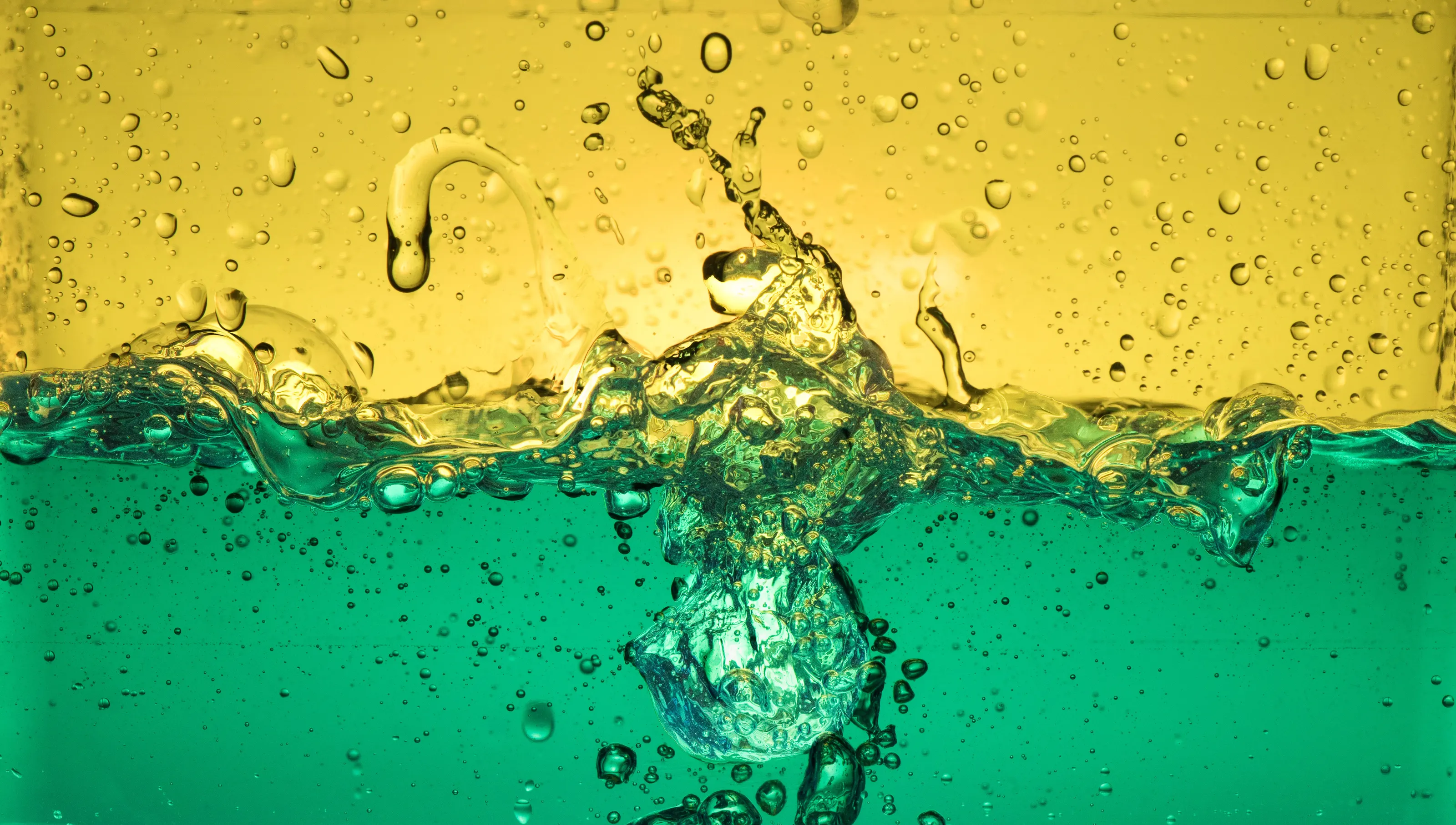
I love all the versions of this image that you submitted by I think I prefer the planet image the most (although kudos to the bowler hat image too).
I wonder how long it took to be able to capture the shapes that you managed to photograph? It's fascinating that something as simple as a drop of water can replicate something much more complex. A reminder in some ways that we're all connected.
You certainly fulfil the brief with the contrasting colours you're using in this image, and I love the relationship between the green of the planet shaped droplet against the blue background.
An intriguing image that demonstrates your talent and perseverance, thanks for sharing!


It was really difficult to choose only 10 images for the top ten and this one almost made the cut just because it was unique from the 6000+ images that were submitted to this contest.
I love it when I click on an image to find one that goes out of its way to be different and tells a unique and interesting story. This image definitely does that in addition to fulfilling the brief of 'contrasting colours'.
The bold, bright blue colour of the paint dominates the frame, contrasting with the white colour that it's covering. It makes me wonder why it's being painted and who is doing the painting?
Just one of those rare images that demand you pay attention. Thank you for sharing!


This is one of those images that almost made the top ten. This was certainly one of those contests when I could have chosen a top 20 and it was extremely difficult to narrow down my selections to just 10 so although this is only in the 'Highly Commended' section I wanted to leave some feedback so you know how highly I thought of this image.
Many of the images submitted have plenty of colour but lack life and narrative whereas your image has both in abundance. Anyone who has participated in the colour run knows how wonderfully vibrant it can be and you captured that wonderfully in this image. I love the faces of the race runners, especially the chap in the bottom right, and the way all the colours combine to make a glorious maelstrom of joy!
If there were a top 11, you'd definitely be in it. Thank you so much for sharing!


There were plenty of examples of contrasting colours in a studio setting in the images submitted to this contest, and it was a struggle to pick one out that stood above the rest, but this one won out because of your composition and how you embrace the colour contrasts throughout.
The blue backdrop plays a powerful role in the composition and gives a base for all the colours. The power of three is implemented through the selection of different sized spoons and the decision to place different colours/textures on each really helps the image pop. I like that you've made order from chaos with the addition of rice, chillies and various other paraphernalia. It shows that throught and care has gone into the composition and the end result has bagged you a top ten position. Well done!


There is something about this image that just makes it jump off the screen. Because of your composition and editing choices the image has a 3D feel and I honestly do feel as if I'm staring through a vortex into a different world where there is a girl running through from a different universe altogether.
I love images like that. It takes a special kind of image to give the feel of 3D from 2D so well done on achieving that. Of course, this contest is all about contrasting colours and you fulfil that brief with gusto, combining the various shares of red with the glimpse of blue at the end of the tunnel.
Your decision to wait for someone to run through at the other end was a wise one as it has made the image work and added some much needed narrative. A compelling scene that absolutely deserves a place in the top ten.


This is something really kitsch about this image and the concept that you're going for really gave me a chuckle. It demonstrates your understanding of narrative and ability to think outside the box.
The idea of showing a bowl of pasta deconstructed in such a way is imaginative, but the image benefits greatly from the way you've brought this creative concept to life.
The strong directional lighting works so well, casting light on the individual components from the pasta to the tomato and basil. The yellow background aids you fulfilling the notion of contrasting colours with the red of the tomato and the green of the basil making the image pop.
A really clever creative concept that has been well executed. Congrats on your top ten position.


