Shutters
Paul Dorey

Shutters

December 2017

Get notified of their new contests

Show the judge some love...

Great contest!

Entry 1322881
10th
154

Most of the elements of this shot fit the brief perfectly and it certainly has a wow factor. Minor quibbles; The finale at the apex of the roof would add rather than distract if it was a bright primary colour. It's a shame that the residential building to the right has crept into the picture!

I can hardly believe that the shot was taken in Kent, UK, and not the Caribbean!

Entry 1326479
41st
154

Although the shutters are small in size relative to the whole scene they are perfect for the colourful effect that you were aiming for. Take a tall stepladder with you next time and get square on to the shot! it would add another point or two to see all 4 sides of the red window surround.

Entry 1326623
4th
1
102
Entry 1334305
83rd
14
Judge
winner

Beautifully captured shot where the main element is enhanced by the figure sitting in the window frame. The colours are subdued but very striking. A good example of a grainy appearance adding to the enjoyment of viewing the image. Well done, a worthy winner for me.

Meet the judge

776 Images entered

Entry 1340782
467th
11

This tightly framed shot displays beautiful patina set off perfectly by the deep black background.You obviously have an experienced and sharp eye for the photo possibilities around as you go. My only minor quibble is that two shutters facing each other at the same angle would have made a great shot perfect!

569 Photographers

51,181 Ratings

Entry 1335258
60th
63
Entry 1339734
95th
22
Entry 1343769
128th
28
Entry 1343988
65th
12
Entry 1345943
28th
8

Brief

See more contest details

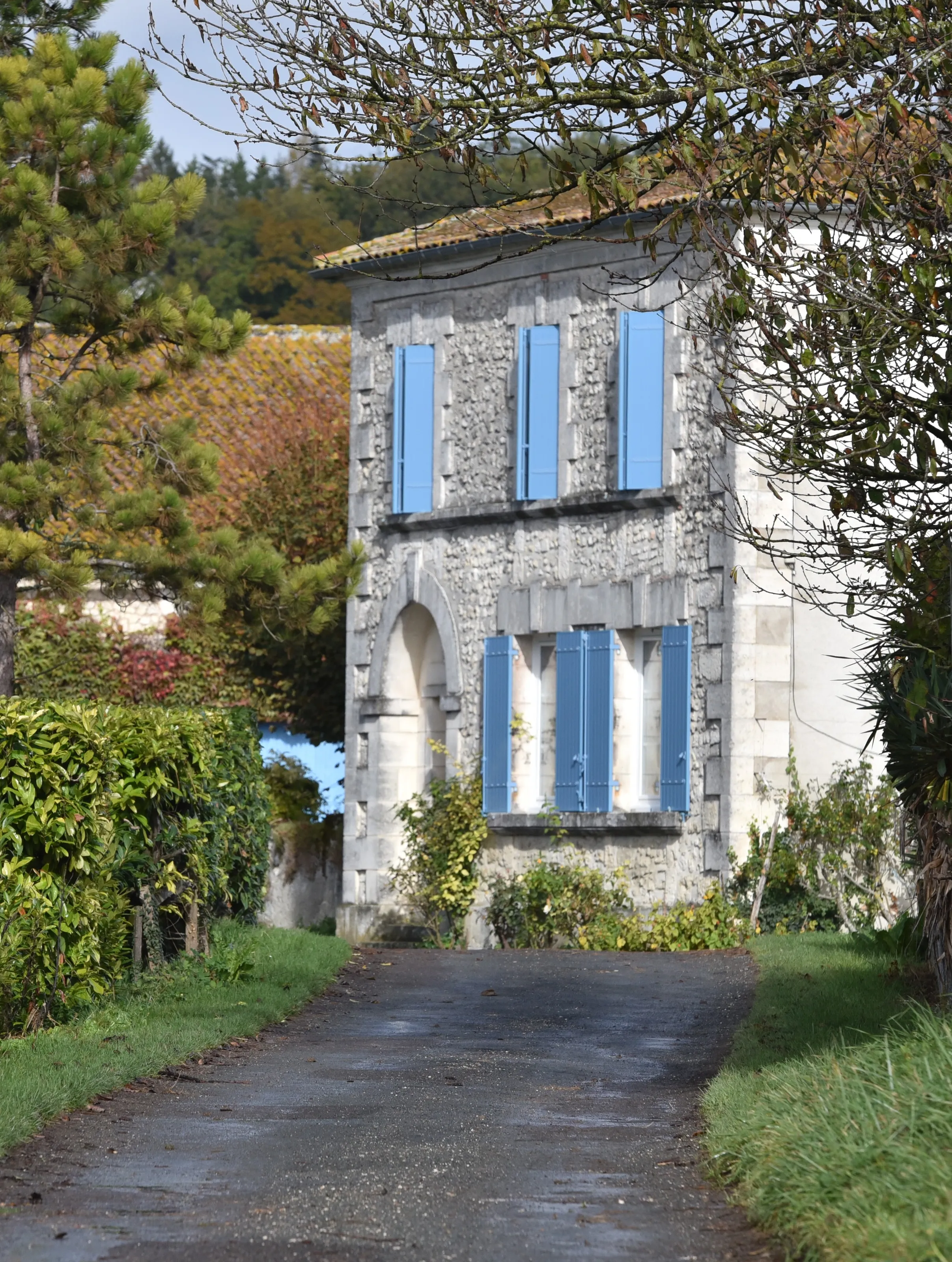
Common in many European countries and beyond, window and door shutters can be both interesting and colourful subjects. I'm looking for colour and creativity in the composition with little enhancement via editing. Surely there's enough going for it without 'technicolor'!?

This shot has great impact and the composition is spot on.I particularly like the blend of bright colours, just feel that the blackened areas are a distraction. And has the top of the frame brickwork been enhanced with photoshop or lightroom? The lines look too straight!

Entry 1320385
56th
154
Entry 1323536
33rd
82
Entry 1324795
13th
21
Entry 1327531
32nd
17
Entry 1335282
15th
150
Entry 1339733
42nd
71