

Deserted towns and city centres have taken on a whole new significance this last year. In the past it would often signify economic decline and abandonment of the high street for out-of-town or on-line alternatives. Here though we see the street looking modern, pristine and inviting, however there is no-one around and the stores are closed, most likely due to circumstance. Great viewpoint and well composed, ensuring all elements are separated and well defined, and the low perspective adds a dynamic to the shot. Shot with plenty of light still in the sky, we get good contrast between the warmer and cooler tones.

This image has been captured from a great viewpoint, looking along the street as it curves up through the frame, leading the eye into the scene. Unfortunately what lets the image down a little for me is that the buildings are all on a tilt, leaning over to the left. It ought to be fairly straightforward to level the image sò the uprights are more vertical, and the image would be enhanced. You have captured some lovely bold colous and good tones which gives the image a richness and warmth. With a little levelling up, potentially a super image from a great viewpoint.


I love this image, quite abstract and full of impact. Excellent use of minimal light within the predominantly dark image, picking out the lone figure dwarfed by the architecture. For me however the image did not obviously look to have been captured on a high street; the central hub for shopping, banking, cafes and bars etc, as these buildings could be anywhere. A great image, and one I like a lot, but not awarded in this contest, as for me it is not on-theme.

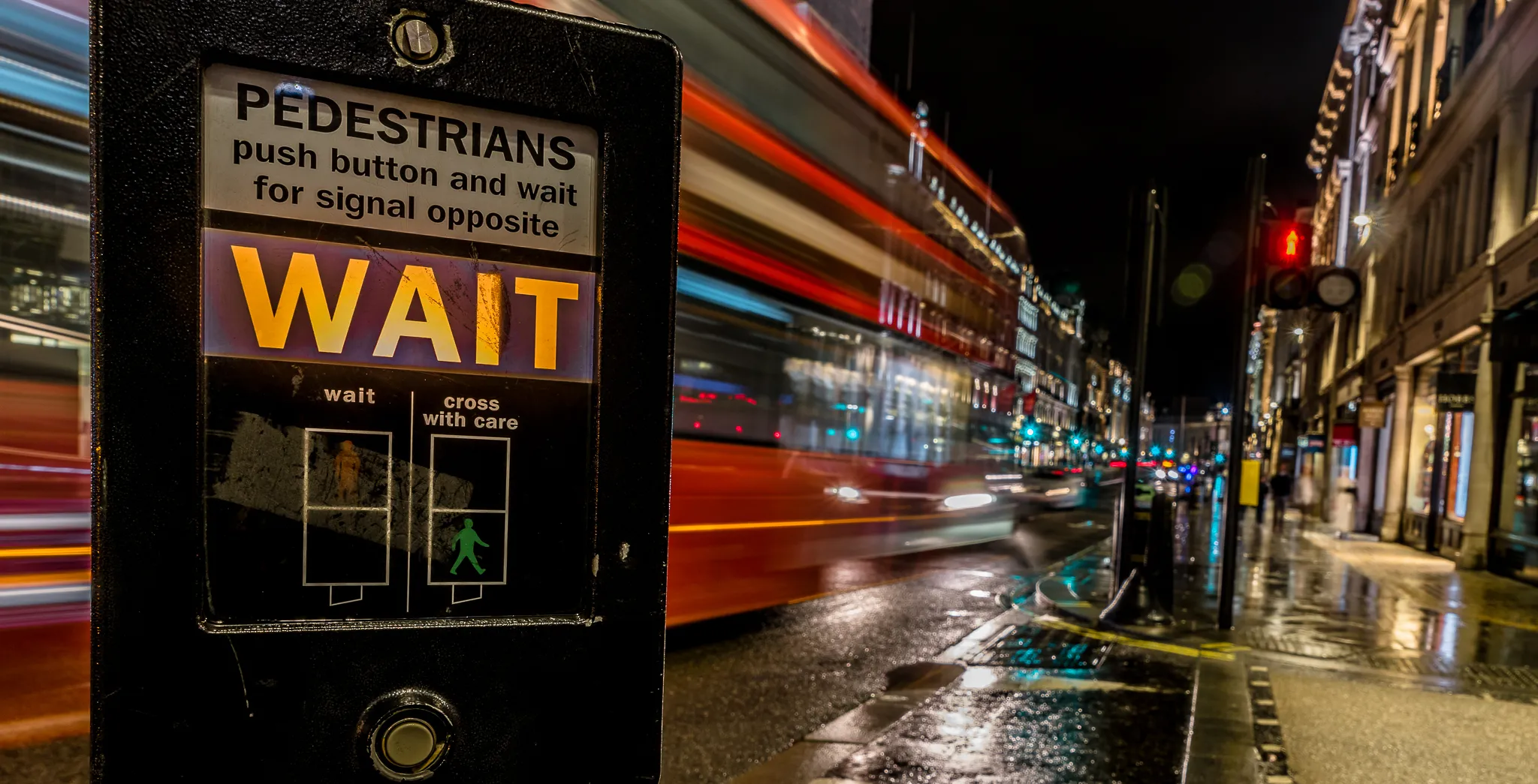
A dynamic night-time city scene, with the long exposure capturing the traffic trails to give a sense of movement. The light trails have been neither under or over-done, as they are clearly visible, but do not block out the seen beyond. The line of lights acts as a leading line to draw the viewer into the frame to look down the shopping street stretching into the distance. Good control of white balance has avoided any ugly colour casts. The capture of the Christmas lights has been done in a way that avoids the image shouting of the Christmas season, which allows the image to be utilised year-round, not just an image capturing Christmas.


This image has a lot of potential for a great shot. What I especially like is the compressed perspective through the use of a long lens, which suits the subject of a traffic jam, as it accentuates the impression of the vehicles squeezed together. Unfortunately, what lets the image down for me is the three very large starburst effect shapes that look to have been added, which draw the eye away from the main subject and do not seem to add to the scene. This is a shame, as you have done well in subdued light to capture some good colouring of the busy night traffic, and I think it would have worked better if the star effects were not included, so instead the smaller red highlights could have been the elements that more attractively drew the eye to the shot. Still an image with a good perspective, filling the frame with the subject.


This is a great shot, but for me only if I turn the image through 45 degrees to view from an naturally upright perspective. Some images work with such a tilt, but for me it has not added anything to the composition, and detracts from what could have been a super monochrome image. Ignoring the tilt, composition of the image is great, with good use of the lighting in editing to pull the eye along the deserted city street into the distance. There is some haloing of light around the edges of the building where it meets the sky, but with a little more work that could likely be eliminated. An image likely to have been in contention to be awarded, but unfortunately the tilt is not for me.


This image to me seems a little confused as to its purpose. It could be a street scene filled with shoppers, or it could be more an architectural image showing the detail of the buildings and upper shopfronts, but unfortunately through the composition of the shot, it appears to be neither, as the people are so low down in the frame with only heads visible, their inclusion seems a mistake. I would suggest for a stronger image of the architecture, to crop the people off completely, and zoom in a little more to the buildings. Alternatively, if you had been aiming for both the people and the architecture, it could have worked to take two images, one pointing the camera a little lower to get more of the people, then tilting the camera higher and taking a second shot of just the buildings, then stichching the two together as a vertical panorama in photo editing. You may have tried that before already, but if not it is certainly worth a try and can be fun to experiment with, allowing a little more to be captured when the view through the lens is a little tight to capture in just one shot.


A rather grim and gritty capture on the face of it, but with the bag providing a little humour and lifting the mood somewhat. Darker tones dominate the image, which helps set the mood and suits the subject, but there are enough areas of brightness to avoid the image being oppressive. Well composed from a low viewpoint, the two figures are the initial focal point, but they do not block the view as the eye can snake down the high street beyond.

This rather mundane scene is so typical of many high streets, but has been well seen and very well captured is an image full of story-telling. The composition makes the most of the juxtaposition between the weather and downcast look of the gent, with the wording on the poster, which leaves the viewer to question whether the poster is a promise of something better to come, or whether this actually is that big day out. The raindrops on the bus shelter have been well captured, as they set the scene to describe the dreary weather, but do not obliterate any of the scene beyond, either of the gent or the street on the right. Conversion to black and white was a wise choice as it suits the subject well.
802 Photographers

Shot into the low sunlight, the resulting image conveys an impression of dusty heat towards the end of the day. Lovely golden tones dominate but look natural, but there are little splashes of other colours, such as where the sunlight shines through the fabric worn by the figure in the mid-distance. The highlights look to possibly be blown slightly at the top of the frame, but that area is not overly bright so does not distract from the near-silhouetted figures strolling down the street. Still a good deal of detail within the image, and the view right down the street invites us to look through the sunny haze.


I want to like this image more than I do, as I am generally a fan of multiple exposure images created in this way, of the same subject captured from slightly different viewpoints. I cannot quite put my finger on where for me this has not worked so well; it could be that the different exposures were too similar, but more likely that the blending mode used, or added processing effect, maybe does not suit this technique too well. The blending mode or added effect looks to be quite harsh and sharpening the edges of the structures etc, whereas many of the multiple exposure images that can be so stunning tend to have a much softer, more organic, fluid feel. It is obviously also personal taste, but it would be worth experimenting with different blending modes, maybe even mixing and matching blending modes across the different layers when blending the exposures. I hope you have fun experimenting, as there is so much potential here.


An unusual viewpoint, offering a rather different perspective on the high street, but I am sure is one many will recognise, with the commercial waste sacks awaiting collection, and the ubiquitous pigeons taking full advantage of the situation. Shot low to the ground, we get a birds-eye view of the street beyond, softened by the shallow depth of field, but still clearly identifiable as an urban shopping street. It does not matter to me that some of the birds are cropped off image, as that helps to describe the little feeding frenzy as the birds compete to pick up a snack.

A monochrome shot of a typical high street, this image has a lot of potential. The black and white works well, with some good contrasts, and the viewpoint looking directly down the street gives impact. Where the image could be strengthened however would be to lose the figure appearing in the frame on the right by slightly cropping the shot, as they are a distraction. At the point of capture you unfortunately need many pairs of eyes to spot people coming into the frame from all angles, and either wait patiently for them to pass, or move forward slightly to remain ahead of them. The photo could also benefit from being levelled up, as the 'horizon' slopes down to the right. Finally, with all contest entries, I would remove the digital signature logo, as it adds nothing, and will usually tend to spoil a good photo by having writing all over it. It would be worth experimenting with this photo for a short time in editing software, to try to crop out the person on the right and the arm that is just in the frame on the left, and level up the tilt. Good attempt however at capturing the high street.


This is an interesting entry that captured my attention, and there is a great story to be told. Some may find this a trivial thing, but one of the reasons this image was not awarded was the addition of the huge white digital frame. To me this only serves to make the actual photo very small and harder to view, and the frame draws all attention away from what we should be looking at, so the frame becomes a subject in its own right. The plain white area of the frame actually takes up more space in the presented image than the picture element, so any award would be more commending a blank white space than any photographic work. This may sound harsh, and digital frames are obviously personal style and taste, but for a contest entry here the impact of the photograph becomes lost, so sadly not awarded in this contest.


I wanted to like this rather experimental image, however it has just left me confused about what it is trying to convey. The architecture in the background, the motion-blurred bus and the partial portrait do not seem to have any clear relationship to each other, and the title did not help with my understanding either. The message is maybe more complex than I can see, but the meaning has unfortunately passed me by. A shame, as this is a creatively edited and well presented image, just for me not conveying its story.


This image is so bright and colourful, it cannot fail to grab the attention. However there looks for some reason to be a blurred vignette effect added, which for me tends to distract rather than add to the image in any way. Otherwise, the bright vivid colours create a bold image, unfortunately for me let down by the radial blurring around the frame. Would be great to see this image without the blur.

This is a great image of night-time reflections on rainy paving. Where I think the image could be improved is my cropping off the top section of the photo, removing most of the buildings, as they are a bit distracting and seem to have a bit of a dull, smudgy look, when compared to the bold and contrasty glistening lights on the wet paving. By loosing the upper part of the shot I think there will be much to be gained. Great potential and reward for heading out on a wet night, but I recommend cropping off ghe top and sed what you think.


45,720 Ratings

1,462 Images entered

The way the key figure in this image has been captured seems to tell the story of a stranger abroad, or someone from the countryside experiencing the city for the first time, as there is a combined look of awe and wonder, combined with a touch of trepidation, as his bag is wisely held close. Good use of depth of field, as focus is clearly on the foreground subject, with the background bustle and buildings falling softly out of focus. Good control of the colours and saturation levels, as nothing looks garish or over-done.

Brief
See more contest details
For so long the commercial hearts of our cities, towns and villages, these thriving thoroughfares are rapidly changing as online shopping and pandemic restrictions change behaviour. We’re celebrating the high street - the many ways in which it brings us together, the businesses and business owners that work to keep it prospering, and the cast of characters that populate it.
Meet the expert judge


A striking image, looking to be captured in current times, of an older lady complete with face covering, window-shopping; in some places still about the only shopping that can be done on the high street. The colouring of the image draws attention to the centrally placed subject, as her clothing and bag look to be predominantly browns, and is surrounded by a sea of purple. Capturing her reflection adds to the image, as does the fact that she is peering through the window rather than simply walking by. Highlights have been well handled, as we see some nice glints of lights, but nothing overpowering.


