
The more I look at this the more I'm entranced. It's a relatively simple composition but its patterns and structure are bold and clean. It reminds me in some senses of Paul Klee's cubist and surrealist efforts. Most of all I love the colours - from bold to more subtle and I admire the photographer for seeing - and waiting for the right light in the first place. A dynamic and beautiful effort amongst a plethora of sometimes exceedingly pedestrian images of windows. Well done.

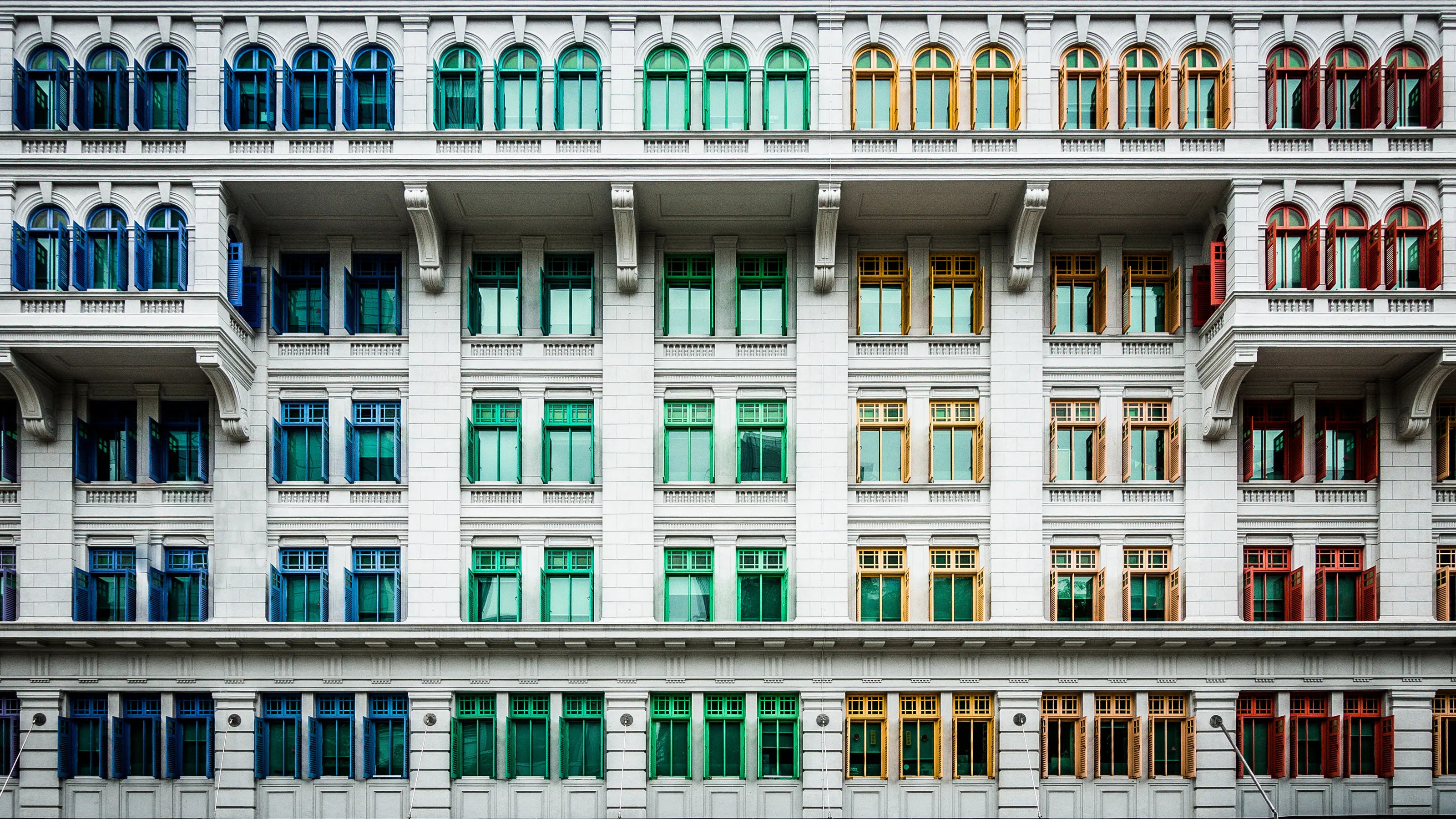
This image - one of a huge number of similars - stands out for several reasons. One, it's well observed and exposed. Two, it's harmonious in that there are no converging verticals or distortion in the frame. More, it has a keen sense of the abstract with (seemingly) random colours but ultimately it's very simple and doesn't try and do more than its capable of. Well done.


What an interesting and well spotted moment. It's the child's hands making an in-focus pint that we can 'anchor' to visually that makes this for me. Always tricky to shoot into light but you've managed pretty well and the figures are pretty well spaced to give a sense of balanced composition. Nicely done.


Beautiful. There's something here of Ralph Gibson's landscape work and this is very well observed, composed and from what I can see, exposed. I love the little detail of the hook on the fence and especially love the textures of the different planes of the image. I'd love to see this as a well exposed print to make sure the shadows are not too deep but this is an excellent, accomplished image.


What a nice change from images of actual windows! A real attempt to think creatively outside of the box. Firstly, I like the colour of the frame which is graded towards a warm, almost mustard feel. The line of the curtains echoes the curve of the model's back and the netting (and the large aperture) excludes extraneous outside detail. Nicely done.


Simplicity is sometimes the key in composition - as is patience - recognising what might work and waiting for it to align. That's exactly what this image does in spades. A really interesting scene with strong lines bisecting both foreground and background, just inviting a fluid, human figure into it to make visual sense. Lovely.

There is a picture to be had here but by the looks of it, the neon sign has fooled your camera (an iPhone) into exposing for the brightest part and making the actual subject - the woman - too dark. Now, I'm a great believer in the old adage, 'the best camera is the one you have with you' but there is an example of the limitations of that. Well spotted though.


Really nicely done. Well exposed and well captured - all the figures are defined and visible and there's a good deal of humour in the frame. Nice use of the windows as frames - small dioramas of action contained within the whole. A little burnt out on the highlights of the white t-shirt but this is a minor quibble. Well done.

There is a picture here and you've almost found it - but the density of your exposure means that the figures are hard to make out. That said, compositionally it's pretty nice - an odd angle and a dynamic backdrop to the people. But a little more careful metering - and perhaps timing to ensure both figures might be showing silhouettes of arms/hands - to make them definable might have made this even better. Well done.

I really like this - the idea's great but I wonder if a more considered framing might have helped? It's good to try and think of what we want to achieve in a frame before we make it. So here, you've put the cat a the bottom left but the window frame is a bit uneven. I wonder whether this might have additionally worked (better?) as an upright - always good to try these things - but also to consider when framing the inherent symmetry of the frame mirroring the subject. Anyway, good effort.

Although this image ticks the box for the theme of the competition, I'm not entirely sure what you were (literally) aiming at. The photographer has to frame what he/she wants the viewer to focus on and, although some creative ambiguity is sometimes welcome I'm not sure what windows we are being asked to look at nor why. If it's the bus, perhaps a bit of tighter framing (framing out the advertisement ), if it's a contrast between the building and the bus then again, a better framing and one which might exclude the light/surveillance camera. Well done for seeing but a bit more thought might have produced something really nice.

There's something here certainly but I wonder if by waiting to see if the crowd outside the window dispersed, it might have been a stronger image - concentrating on the people that are seated. As it stands the image is a little confusing. Sometimes patience is key as is simplifying our compositions - photography is rarely a symphony with multiple elements, more like a simple tune.


7,241 Images entered
3,481 Photographers
301,723 Ratings


Meet the expert judge


Brief
See more contest details
An interesting subject to explore, windows are with us all the time. If you shoot architecture they form a part of the patterning and character of a building, often repetitive, the old ones sometimes ornate. In portraiture, looking out through them can become a symbol of longing, hope, or the future. They mark that boundary between our indoor life, of household or work, and the life we lead outdoors. All of your shots of windows are welcome in this contest.


I like this very much - if only for the incompleteness of framing just half of the green tree. I like that this breaks the conventionally boring compositional rules of 'getting it all in' and I especially like the colour clash of the burnt sienna of the wall and the vibrant green. The 'plain-ness' of the images allows us to contemplate the small things - like the water staining under the windows and the centre line of the building. Nice.


Taking this skylight as a window, this image is a good example of how to meter to give emphasis to a subject. Although I suspect that a fair amount of burning-in has been visited on the image in post-production, the technique makes us follow the beam of light onto the face and accoutrements of the technician obscuring extraneous detail. It's nicely done and an object lesson in deciding what's important for the image to work.


Love this. A well developed sense of composition and observation has elevated this Frame above many others that saw a pattern in a building and just shot it as was. Clearly an element or fortune in spotting the woman - and the paint splashes - but this works on a pleasing graphic and colourful level.


Sometimes we plan and sometimes we just get lucky. I'm not sure what lay behind this image but either way this just works as a fortuitous moment. I'm not mad on the post production colour work - if an image is strong it doesn't need to be played with - but as a metaphor of fragility in the big, bad city, this isn't a bad effort. Well done.


Nearly. I think that this has all the visual elements of a really interesting and engaging photograph. But. But... its abstraction is both its strength and its weakness. The idea is strong but sometimes reflections don't do what we need them to do because of the angle of light. There IS an image here but you might have needed to wait a bit longer so that the shadows are more developed and potentially altered your angle so that the background says more to the reader. But good effort for seeing.


This image's simplicity belies its rather complicated structure and its excellent exposure. I like the shapes that bring us through into the image at the centre - the circles and curves balancing well the straight lines and the fallen blinds in the foreground,. What I additionally like is the attention to make sure both highlights and shadows have been well recorded. Really nicely done.

This is a nice frame - but I want more. It tells a story but it could be clearer: The man in the right window is partly obscured by the bus frame and I can't really see what the chap in the left window is doing. Also there's a lot of space to the right of the frame which isn't doing much. The woman looking around - which I suspect grabbed your attention in the first place - is engaging but these things are about timing and a dollop of luck. They are also about where you stand and your closeness to what you're guiding us to examine. Still, good to have seen this - keep pushing.

Beautifully done and like so few of the entries here, very well seen! A delightful composition - if I was being picky, I might have waited for a more clearly delineated set of feet above but actually I quite like the chaos of the central composition. Perhaps a more off-centre circle of feet might have made a more arresting image but this is lovely and a very strong piece of visual storytelling.


I do like this but I'm left wanting more - not for more of the building - but less. If we're going to be brave in composition then maybe let's just have one block of windows - or even half of them to really push the viewer to see. That said, I think that this works and I like the monochrome effect which concentrates away from any colour distractions and I like that the sky's tone/detail is nicely captured.

Sometimes the best images are not in front of us and I'm always suggesting photographers really look around them for visual inspiration and wonder. This image has been well spotted. I love the multiple layers of reflection and the countless shapes and patterns. I also like its imperfections; the non-straight lines and the slight distortion. I'd like to have the sky more accurately metered so as not to compress highlights but this is a minor niggle. Excellent image.


Sometimes the everyday with the addition of some thought and decent composition can become a thing of wonder and beauty. Here, a simple image of a reflection in a canal has been elevated to something special by movement and a little consideration. Abstract in its conception this frame gives lie to the idea that there's only one conventional way to image windows - or indeed life itself! Lovely.


