Get notified of their new contests


First of all, many thanks to everyone who took the trouble to submit an entry into this contest. I really enjoyed studying each of your submissions, so much so that it took quite some time to work through them all. I have selected those that I felt succeeded most in making a fingerpost the focus of attention within their photo. I was unsure what to expect: simple shots of pointers against a plain background, or more detailed ones of posts in their environment. In the event, there were all extremes and I found myself presented with a full spectrum. I know it’s Christmas, but I cannot gift awards to everyone, so I apologise if yours was missed and hope that you enjoyed taking part anyway.
My winning pick is this shot, entitled “To The Charter Of Rights”, so let me explain how it won my selection: The white on black has produced a striking, contrasty shot that gets it noticed. The subdued colours of the background maintain the contrast, whilst providing information about its modern setting without distracting from the primary focus. The sign is easy to read in crystal-clear detail and has been neatly cropped, leaving no doubt about the subject matter. Combined with an informative title and some history in the description, it met the brief perfectly. A more catchy title would have done even better but it is not always easy to find one for such a mundane subject and was not necessary in this case. Well done, and thank you for your contribution.


The Pennine way is a long-distance path. The cloud and path disappearing off into the distance suggest that there is still some way to go. I get the impression that the weather and and landscape are typical of what a walker should expect, yet invite the viewer to follow its path. The sign fits perfectly within the lighter space offered by the sky and the writing on it is clear to read.


Brief
See more contest details
A fingerpost is a particular type of direction sign, consisting of a post with one or more fingers, or arms, each pointing in the direction of the place named on it and, maybe, the distance to travel. Your challenge is not just to find one but to make it as interesting as possible. Please make sure that your signs are the main subject of your photo and not a landscape in which there happens to be a signpost in the distance. I hope you enjoy the contest.

A great photo. At first I thought it was more of a landscape but it would not have worked without the fingerpost. It is a picture of a sign with landscape behind. Without the sign, the balance would have been completely wrong and I’d only be able to credit the level horizon. The sign adds volumes to the picture, telling you exactly where it was and encouraging you to seek out your walking boots.


500 Images entered


378 Photographers
Meet the judge
19,040 Ratings


I’m told that everything is bigger in America and this shot tends to reinforce that. The low angle has improved its visibility and made it ‘stand proud’ over the neighbouring buildings. I’m not sure how it is supposed to function as a signpost – there seem to be far too many directions of travel and an interesting range of distances. The symbol on the top is curious and may provide a clue.


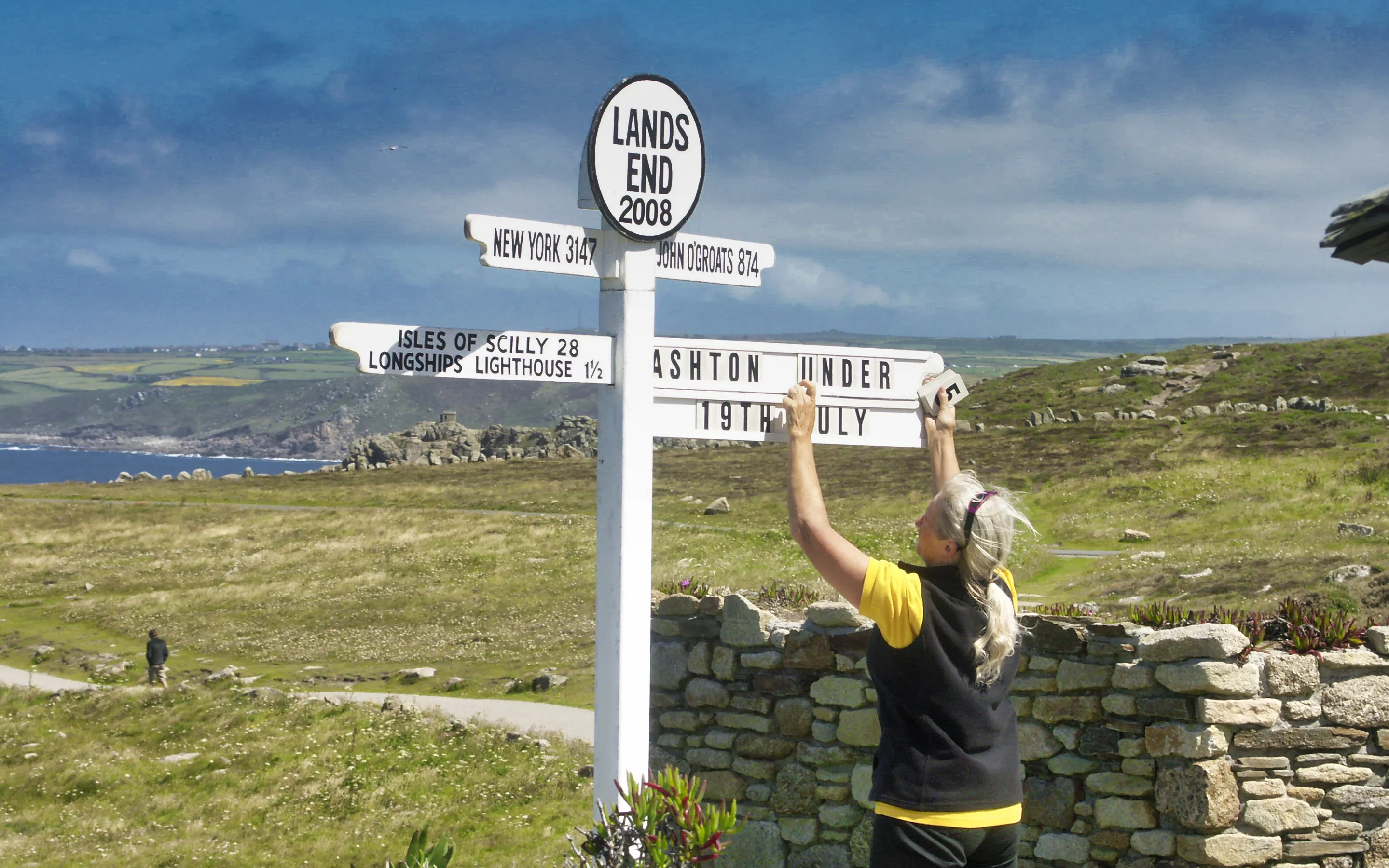
At first sight I felt that the walker in the background was a distraction from the sign. I'm unsure if this was an intended inclusion, or not, but it reinforces to the purpose of the sign and balances with the pointer in the top right. The focus is clearly on the signage, rather than the landscape - and I liked it.


This is a fine photo of a footpath sign in a lovely setting. The scenery is most inviting, whilst a certain mystery is provided about what may be discovered beyond the hedge. The picture may have been composed instinctively but demonstrates the usefulness of the ‘rule of thirds’ to obtain a satisfying composition.


