Get notified of their new contests


In this contest, I definitely wanted to see technically strong images, but more importantly, images that had a transformational effect on their subject. But also, I had said 'close focus', not macro - I wanted to encourage image-making with the most basic tools. Whilst absolute technical quality was important, it wasn't primary because I didn't want to exclude those with no special macro kit, or with only basic cameras.
The standard of entry was pretty high and I quickly found that what was differentiating the images was more the story they told than their technical precision. I think photography may always have been this way really.
My winning image has been taken with a hobbyist level camera and is yet technically pretty sound. Where the image excels though, and I mean really excels, is in the characterisation and storytelling element.
There were various takes on this theme in the entries, but none quite so gentle and nurturing as this. Bringing with it a meta-level of contrast - such rugged, forged, elements enacting such a sweet relationship. The reality of the subject has been completely transcended.
Ultimately this is why I have placed it first.


Here's a photo that does what it says on the tin!
The focus is really well controlled. Perhaps the brush handle and the right-hand bucket handle lug are a tad soft, but the image totally carries that.
For me, the reflection at the bottom is odd, as though this were a 'pack shot' whereas I see it as more of documentation... I'm just not sure it's an appropriate effect for this subject, which is otherwise arranged in a really clear story.


In a contest like this there are so many very finely crafted still life images - but few that capture such drama as is apparent here. I cringe looking at how closely he works that material to the blade!
There's some weird ghosting on the arms and hands and the focus isn't quite bang on BUT it's a really compelling image.

This image is excellent. The specular highlights are under control. The shadows are not blocking-up. The focus is sharp. The elements are coherent (the cutter is presumably sat upon metal that it has cut). And the thing itself is highly evocative of our engineering past.
It looks like a trophy. It is a triumph.


Whilst I did not want to require expensive or complex equipment, as soon as I saw this shot I knew instantly the sheer amount of effort, and/or experience, it took to create.
Also, for me, photography is so much about showing people things they don't normally get to see; or showing people things in a new way. Which is exactly what this image does.

Machines that look like alien robot faces! Always got to love them. A really well-observed shot.
The centre of the left paddle is in sharp focus but the rest don't seem to be. It looks like some kind of cut-out has been applied to the paddles and that they are losing definition in places.
One of those 'makes you smile' images though.


I love this - looks for all the world like a brash young fledgling puffing its chest out - you have given this real character.
A little tightly cropped on the left for my liking and I would have preferred more definition to the left - also there seems to be a repetitive pattern bottom right corner - not sure if that may be due to cloning?
The attitude and character of the subject though make it a fine image.


Here again, I see great transformation. Instead of pliers and saw blades, I see a shark swimming amongst jellyfish.
The back end of the plier is somewhat lost to the background, a rim light may have helped - but the degree of transformation achieved with just 3 compositional elements is really strong.


A number of entries employed very similar light and colour palette treatments - but here I felt the simplicity of the arrangement to be very appealing.
The two items belong together, as shown by their relative placements, but they do not snag each other up. It is a tight and well-balanced composition.


I felt that this was a deceptively simple image with none of the drama and pizazz we so often see in the digital domain - a story told in a quieter way.
The zone of acceptable focus is well placed. The attitude of the camera to the map well set. The leading diagonal of the calliper well chosen. The intersection of calliper tip and compass arrow perfectly set. Overall a real attention to detail.


It's great to see action in this shot - elevating it from just another clockwork still life. Because of that, I think you could have done away with some of the surrounding context/clutter(!). The cog, in the jaws of the grip, being fitted is such a compelling moment I want the image to really focus in on that with a much tighter crop. Its a strong image.


500 Images entered
282 Photographers
18,877 Ratings


This is a very proficient image - perhaps not immediately exciting like some super close macro shots can be. But then I read the description and came to appreciate a very intricate and involved story.
Sometimes after all the pizzazz of high-resolution digital imagery its good to see something that tells a story in a more down to earth way.


Meet the judge

Love the colour contrast, the near silhouette and the luminance of the bubbles.
This has real graphic appeal, but for me it lacks a little in terms of making sense - but your description says the same, you just like the look of it and that's fair enough.
I like the look of it too which is why I have highly commended it - but rightly or wrongly I felt the top 10 should exhibit less 'happenstance'!
Brief
See more contest details
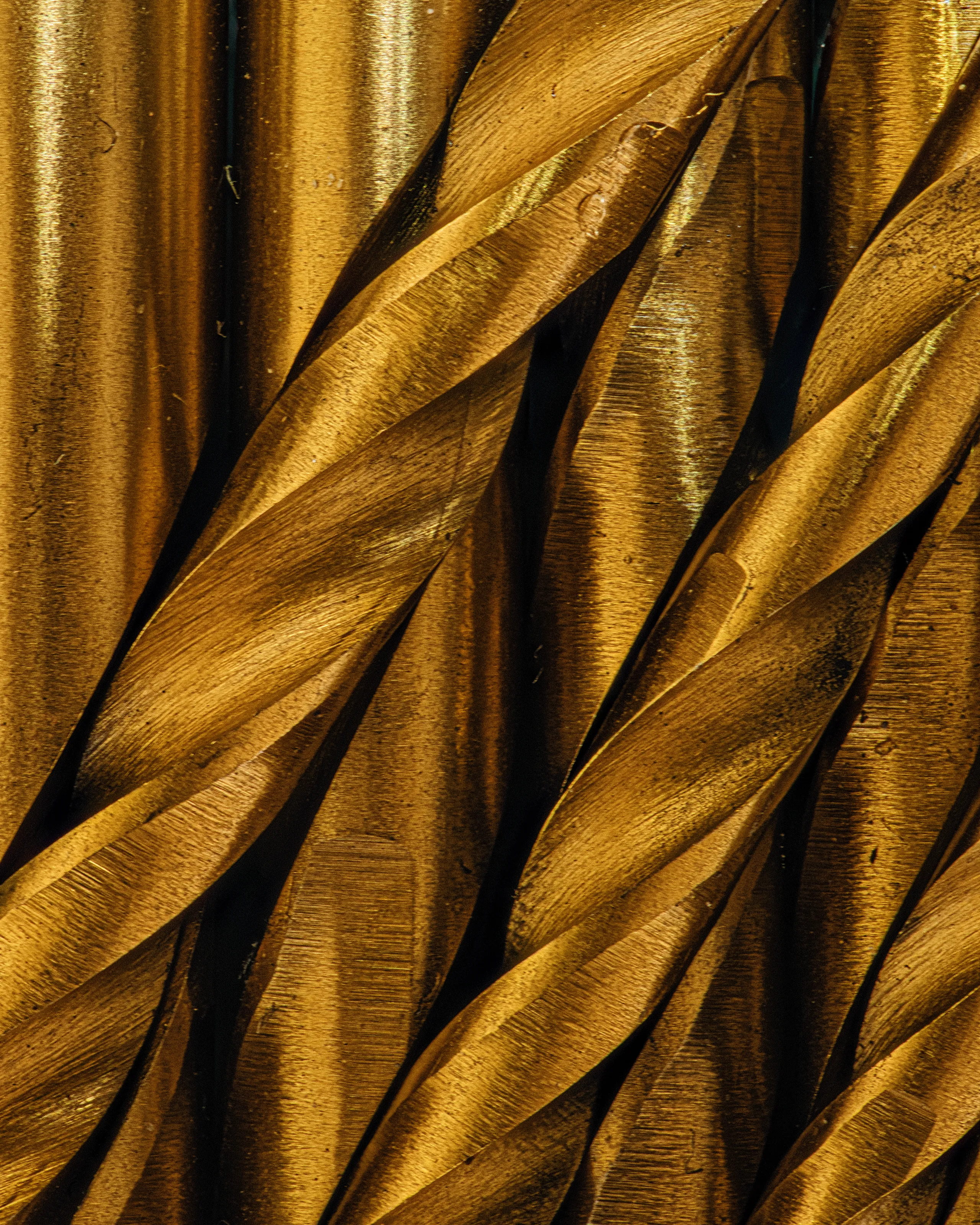
This contest is for your photos of tools, which have been captured at the closest focus. There is no need to use special macro or close-up kit, (although you can if you have it); just work as close as your camera lens will allow. Try to capture some of the great detail in the tool's burnishing or woodgrain. Working close-in encourages some abstract graphic form and has the ability to show details we otherwise miss.

These spanners are so cute how could one not photograph them!
And you have done so with aplomb - well lit, well focused; a technically strong image.
But compositionally I don't quite get it. It feels to me that, apart from making the most of how they almost fit together, the arrangement is a little ad-hoc.
I wonder if this is actually a golden opportunity to work with the negative space. A little more space between each would create a single flowing, almost sine curve which would be just as interesting as the spanners themselves.
I know these things are highly personal and what I say may be of no help at all! So let me re-iterate how fine an image it is.


Technically flawless, a really great shot.
I guess though I just don't quite understand it. Whilst I get that not every image has to tell a story, it feels like this one wants to but I just don't know what it is.
It's so well done though you probably don't need my judgement of it anyway! Perhaps if I saw it in the context of a greater body of work, or perhaps even if it just had a title, I may have had a different response to it.
It is however, undoubtedly a really fine image.


A very lovely, quality, shot with sympathetic lighting and a very well controlled palette.
The composition encourages a restful consideration of the artefact itself.
I'm unclear on the relationship between the cutter and the box (it doesn't look like the cutter lives in that box) - so the overall story of the image isn't totally coherent for me. bUt it is certainly an image that demands to be highly commended.


The mixture of the materials and textures in this image is truly wonderful.
The shutter speed is appropriate to avoid any minor camera shake effects and the ISO is low enough to avoid excessive noise. But I see these have led to an aperture of f/7.1 - making the nails and the fabric really sharp, but the top faces of the tools slightly soft. It may have been worth experimenting with the effect of using f/11 or perhaps f/16 to attain slightly greater depth of field.
All that said, in the context of this competition it is a unique composition.


Specular highlights can easily get out of hand and spoil a macro shot - but here you have placed them carefully and the image works well. I like how the writing is legible but not necessarily comprehensible!
I feel it is a shame that focus is soft at the very tip of the nib - f/16 may have resolved that.

Well, it IS just a Stanley knife, but it is a very well photographed Stanley knife.
Nice blade choice with its contrasting colour. Great sharp focus, with a softness to the background. No specular highlight distractions and hardly any blocked up shadows. Really well-controlled in camera.
The vignette though gets in the way for me, most especially its effect on the tip of the blade.


We often seek strong contrast between subject and background but in this case, the wrench absolutely must lay in the same mud that it is caked in! This is a really evocative image - in that it takes me to think of times I've been working in wet and muddy conditions.
Along the top/left there's a band of yellow creeping into the frame that slightly spoils the coherency of the pallet, to my eye anyway - perhaps a very slight crop may help?


I think this is perfect control of the plane of focus and depth of field. The forward handle is just sharp enough not to become a distraction, and you have isolated the important detail really well. I think the graduated scale section just needed a little more light on it to really make the centre of attention stand out from the surroundings - which the nut to the left does do.


I think you have honed in on exactly the right part of this saw, the shape of that handle is great and you have put the focus bang on the right place (the little decal). I do wonder if we should have seen the entire handle (not sure but worth considering).
The lighting is a little flat and there are distractions in the bottom corners of the image - but it s a really well observed shot


